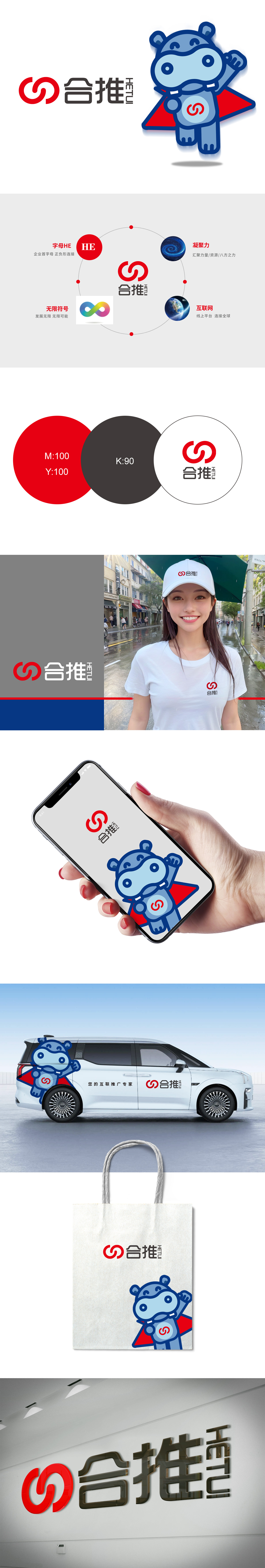
狮动设计通过“汉字+字母+形态”的三重编码,将抽象的“合作”与“推动”转化为可感知的视觉语言:汉字“合推”:“合”代表融合、协同,“推”代表前进、发展,二者组合直接点题品牌核心——“以合作推动共同发展”;英文“HT”:取“合推”拼音(Hetui)的首字母,设计为两个交织的红色圆环:圆环的“交织”象征“连接与融合”;圆环的“动势”传递“推动与前进”的力量感;整体以“品牌理念”为核心,用“视觉逻辑”为工具,将抽象的概念转化为可感知、有记忆点的符号系统。
Lion Design transforms the abstract "cooperation" and "promotion" into perceptual visual language through the triple coding of * * "Chinese characters+letters+forms": Chinese characters "push together": "push together" stands for integration and cooperation, and "push" stands for progress and development, and the combination of the two directly points to the core of the brand-"promoting common development through cooperation"; English "HT": Take the first letter of Hetui pinyin and design it as two intertwined red rings: the "interweaving" of the rings symbolizes "connection and integration".


扫码或拨打添加客服微信


