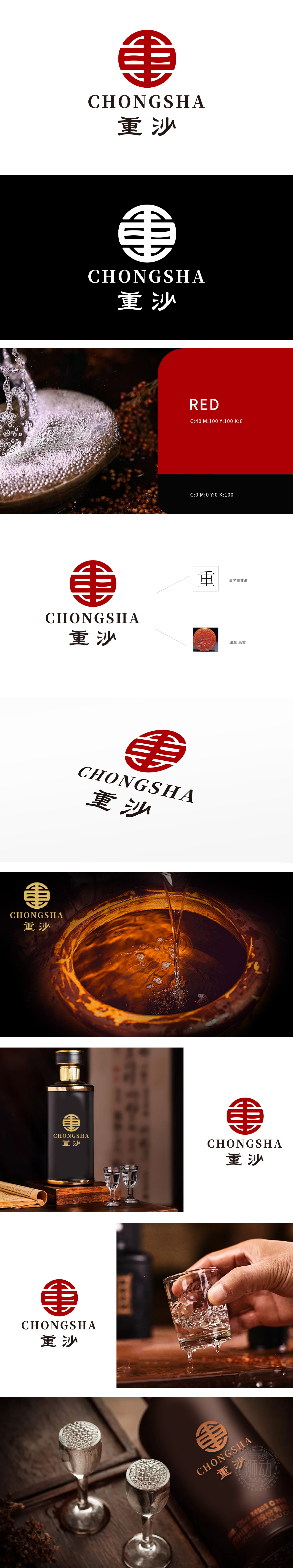
狮动设计标以“重”字为骨架,通过线条的拆解与重构,形成既似印章篆刻又似酒液流淌的视觉形态。红色圆形轮廓如酒坛封口,厚重而不失张力,每一道水平线条似酒曲发酵的层叠,垂直线条则如酒窖深处沉淀的时光。以“重”字为魂,将印章的稳重与汉字变形的灵动凝练成视觉符号,让新客户在初见时便赞叹:“这不仅是酒标,更是一枚能品出岁月醇香的东方印章!”
Lion design logo takes the word "heavy" as the skeleton, and through the disassembly and reconstruction of lines, it forms a visual form that is both like seal cutting and like wine flowing. The red circular outline is like the sealing of the jar, which is thick without losing tension. Each horizontal line is like the stacking of koji fermentation, and the vertical line is like the time of precipitation in the depths of the wine cellar. Taking the word "heavy" as the soul, the steadiness of the seal and the agility of Chinese character deformation are condensed into visual symbols.


扫码或拨打添加客服微信


