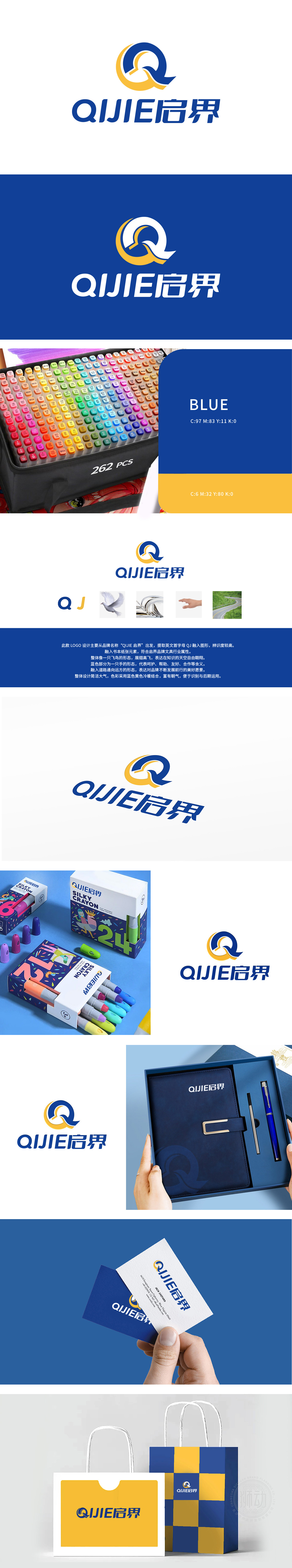
狮动设计以品牌名称首字母“QJ”为设计原点,通过艺术化处理形成核心图形,既直接关联品牌名称,又避免直白呈现,增强视觉独特性。整体图形轮廓形似展翅高飞的鸟类(如鸽子),传递“自由翱翔”、“突破界限”的意象,契合“启界”(开启新界域)的品牌名称精神。蓝色(专业、可靠、理性)与黄色(活力、创新、光明)的对比搭配,既形成视觉冲击,又平衡办公场景所需的沉稳与活力。通过多维度元素的有机整合,既塑造出独特且易识别的品牌形象,又深度传递办公文具行业所需的创新、协作、成长等价值理念。
Lion design takes the initial letter "QJ" of brand name as the design origin, and forms the core graphics through artistic treatment, which not only directly relates to the brand name, but also avoids straightforward presentation and enhances visual uniqueness. The overall graphic outline looks like a bird (such as a dove) flying high, conveying the image of "flying freely" and "breaking through the boundary", which is in line with the brand name spirit of "opening the new territory". The contrast between blue (professional, reliable and rational) and yellow (energetic, innovative and bright) not only forms a visual impact, but also balances the calmness and vitality required for office scenes.


扫码或拨打添加客服微信


