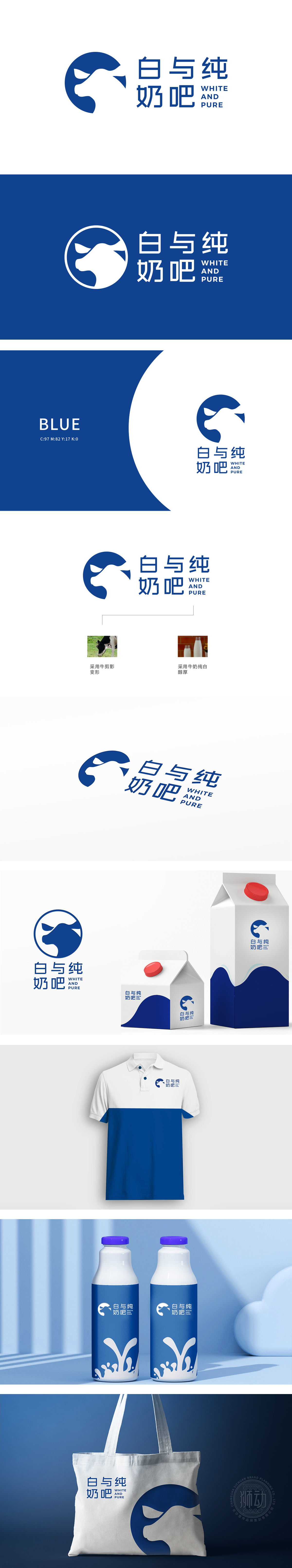
狮动设计logo左侧采用牛的剪影变形设计,简洁而富有创意。牛的形象象征着牛奶的来源,传达出自然与纯净的理念。使用深蓝色作为主色调,蓝色通常给人以清新、纯净和可靠的感觉,符合“白与纯”的品牌定位。“白与纯奶吧”字体简洁大方,易于识别,直接传达品牌名称。通过“牛剪影”和“牛奶纯白醇厚”的元素,直观地表达了品牌专注于高品质牛奶的理念。整体设计风格简约现代,线条流畅,视觉效果干净利落,符合现代审美趋势。
The left side of the lion design logo adopts the silhouette deformation design of cattle, which is simple and creative. The image of cattle symbolizes the source of milk and conveys the concept of nature and purity. Using dark blue as the main color, blue usually gives people a fresh, pure and reliable feeling, which is in line with the brand positioning of "white and pure". The font of "White and Pure Milk Bar" is simple and generous, easy to identify, and directly conveys the brand name. Through the elements of "cow silhouette" and "pure white and mellow milk", the brand's concept of focusing on high-quality milk is intuitively expressed.


扫码或拨打添加客服微信


