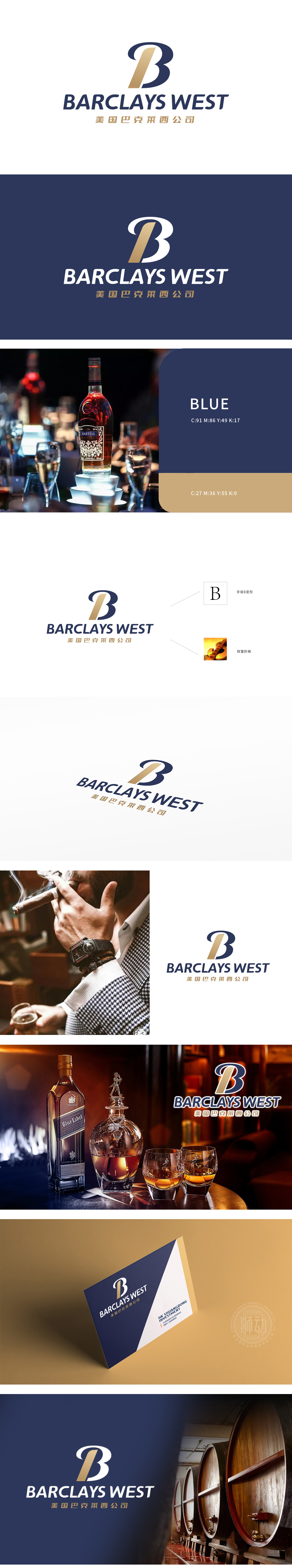
狮动设计采用以变形字母“B”,宛如一支被精心雕琢的雪茄,侧影挺拔而充满张力。其流畅的弧线设计,巧妙呼应了红酒杯中佳酿摇曳的曲线,亦似威士忌酒液在光影下的流动轨迹。狮动以极简笔触提炼两种奢华品的轮廓精髓,使“B”不仅是品牌名称的缩写,更成为行业特性的视觉载体。金色填充的“B”内部,如同雪茄点燃时散发的琥珀色光泽,或是酒窖中陈年佳酿的醇厚质感,瞬间唤醒受众对高端生活方式的联想。更将雪茄的优雅轮廓与酒的流动韵律注入设计基因,让品牌标识成为奢华与沉淀的视觉符号,无声却有力地诉说着高端行业的品味与底蕴。
Lion design uses the deformed letter "B", just like a carefully carved cigar, and its silhouette is tall and straight and full of tension. Its smooth arc design skillfully echoes the swaying curve of fine wine in a red wine cup, and it is also like the flow track of whisky in light and shadow. Lion Motion refines the outline essence of two luxury products with minimalist brushwork, making "B" not only the abbreviation of brand name, but also the visual carrier of industry characteristics. The interior of the "B" filled with gold, like the amber luster when a cigar is lit, or the mellow texture of old wine in the wine cellar, instantly awakens the audience's association with high-end lifestyle.


扫码或拨打添加客服微信


