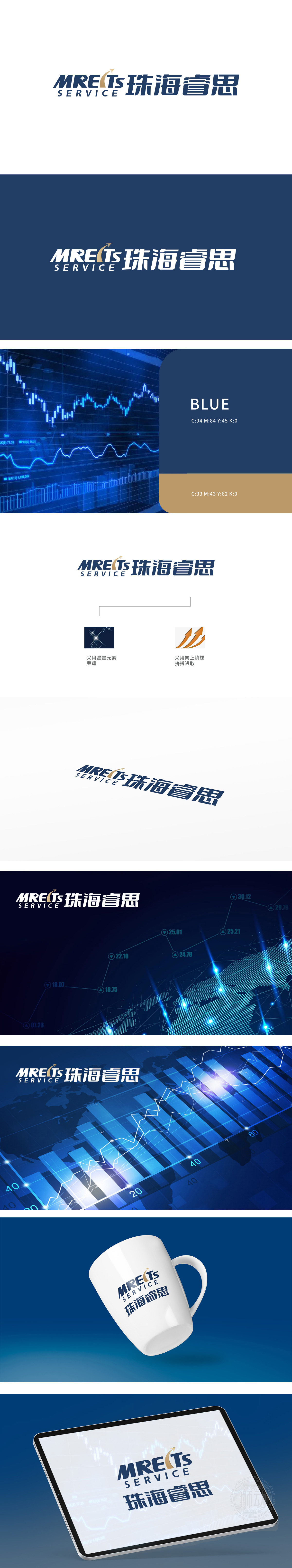
狮动设计基于MREITs”字母框架,其倾斜角度与力度堪比股市中突破阻力位。箭头尖端刺破虚空的视觉效果,传递出市场穿透力与决策果敢性,暗示品牌在资本博弈中“一剑封喉”的魄力。箭头锐利的角度与逐级攀升的动态,如同牛市阶段股价的突破之势,传递出稳健增长与锐意进取的金融属性。色彩张力传递出品牌“以稳健根基驾驭激进策略”的投资逻辑,赋予LOGO超越图形之外的金融辩证思维。狮动以极具张力的构图与象征性元素,将MREITs珠海睿思的品牌精神凝练为一场资本市场的向上突围——这不仅是LOGO,更是一份向财富增长宣战的视觉宣言,每一笔线条都暗藏股市脉搏的跃动。
Lion design is framed by MREITs, and its tilt angle and strength are comparable to the breakthrough resistance level in the stock market. The visual effect that the tip of the arrow pierces the void conveys the market penetration and decision-making boldness, suggesting the brand's courage to "seal its throat with one sword" in the capital game. The sharp angle of the arrow and the dynamic climbing step by step, like the breakthrough of the stock price in the bull market stage, convey the financial attributes of steady growth and forge ahead. Color tension conveys the brand's investment logic of "controlling radical strategy with a stable foundation" and endows LOGO with financial dialectical thinking beyond graphics.


扫码或拨打添加客服微信


