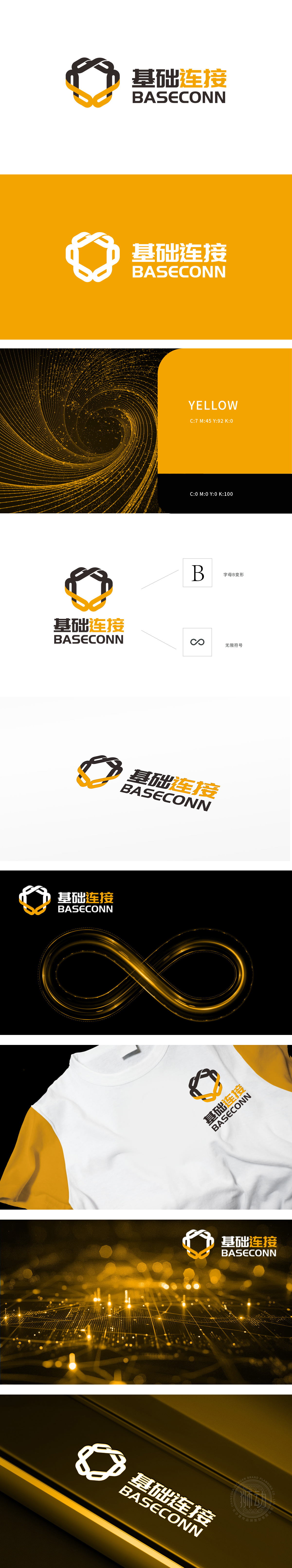
狮动设计采用立体“B”字母,突破传统字形束缚,以几何线条的交错与叠加,呈现出数据网络的结构感。线条的流动与穿插,如同信息在数字链路中的高速传输,既传递出“基础连接”的稳定性,又暗含科技创新的动态张力。橙色与黑色的对比碰撞,既形成视觉锚点,又营造出活力与沉稳的平衡——黑色代表技术的扎实根基,橙色则喻示着创新突破的动能。整体设计以简洁而富有张力的构图,在字母变形与无限符号的交织中,构建出连接万物、突破边界的设计叙事,展现出狮动对科技互联时代的深刻洞察与美学表达。
Lion design breaks through the traditional font constraints with the three-dimensional "B" letter, and presents the structural sense of data network with the interleaving and superposition of geometric lines. The flow and interpenetration of lines, like the high-speed transmission of information in digital links, not only conveys the stability of "basic connection", but also implies the dynamic tension of scientific and technological innovation. The contrast collision between orange and black not only forms a visual anchor, but also creates a balance between vitality and calmness-black represents a solid foundation of technology, while orange symbolizes the kinetic energy of innovation and breakthrough.


扫码或拨打添加客服微信


