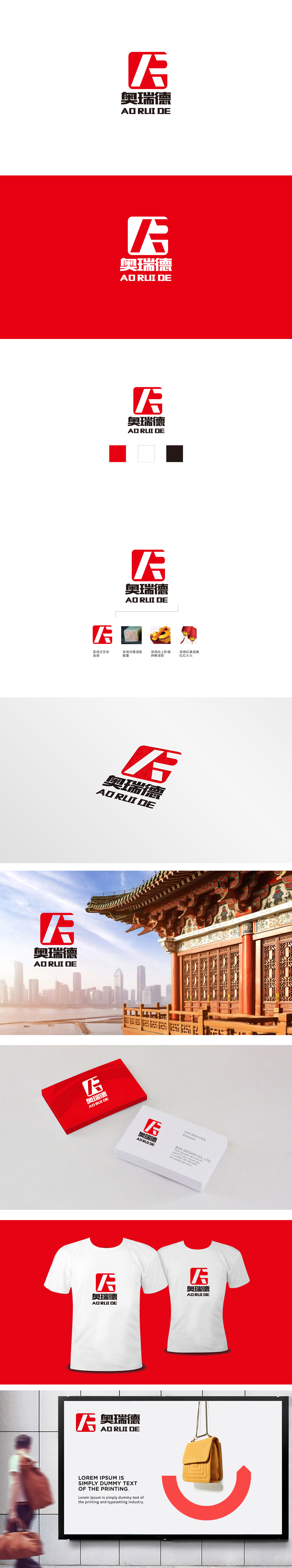
狮动设计采用红色正方形作为稳固基底,几何线条以正负形手法嵌入,既保留了LOGO的高辨识度,又通过虚实关系增加了层次感——简单几笔,就把“简洁有力”的品牌形象立住了。“阶梯”的设计,像极了企业“一步一个脚印、拼搏进取”的精神。这种“具象符号+抽象精神”的转化,让设计不仅好看,更有了“灵魂”。用红色代表“红红火火”的喜庆与活力,黑色则平衡了红色的跳跃感,增加了“稳重”。这种“配色与理念的精准匹配”,让整个设计既符合大众审美,又传递了品牌的核心价值观。
Lion design uses red square as a solid base, and white geometric lines (like "F") are embedded in positive and negative ways, which not only retains the high recognition of LOGO, but also increases the sense of hierarchy through the relationship between reality and reality-a few simple strokes will stand the "concise and powerful" brand image. The design of "ladder" is very similar to the spirit of "one step at a time, striving for progress" of enterprises. This transformation of "concrete symbol+abstract spirit" makes the design not only beautiful, but also "soul". In the room, red represents the joy and vitality of "thriving".


扫码或拨打添加客服微信


