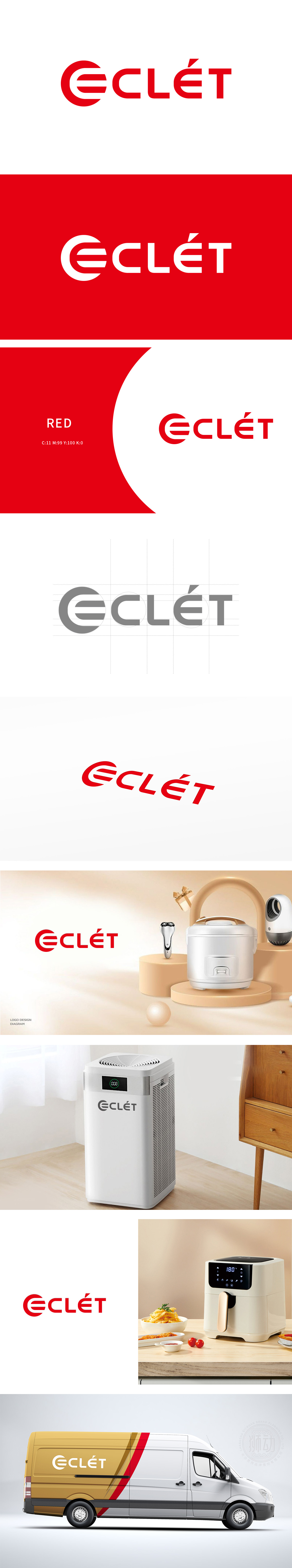
狮动设计以字母“E”的半圆结构与“C”的流畅弧线,隐喻产品的人体工学设计或水流动力学原理,让用户直观感知产品的“易用性”与“高效性”,粗壮有力的字体排布,如同厨卫设备中扎实的金属结构,传递出“坚固耐用”与“工业级品质”的信任感。ECLéT正以刀刃般锋利的创新姿态,切割市场边界,定义科技生活的锋芒。将“实用功能”与“技术精度”抽象化,转化为极具冲击力的视觉符号。
Lion Motion Design uses the semicircle structure of the letter "E" and the smooth arc of "C" to metaphor the ergonomic design of the product or the principle of hydrodynamics, so that users can intuitively perceive the "usability" and "efficiency" of the product, and the strong font arrangement, like the solid metal structure in kitchen and bathroom equipment, conveys the trust of "firmness and durability" and "industrial quality". ECLéT is cutting the market boundary and defining the edge of scientific and technological life with its innovative attitude as sharp as a blade.


扫码或拨打添加客服微信


