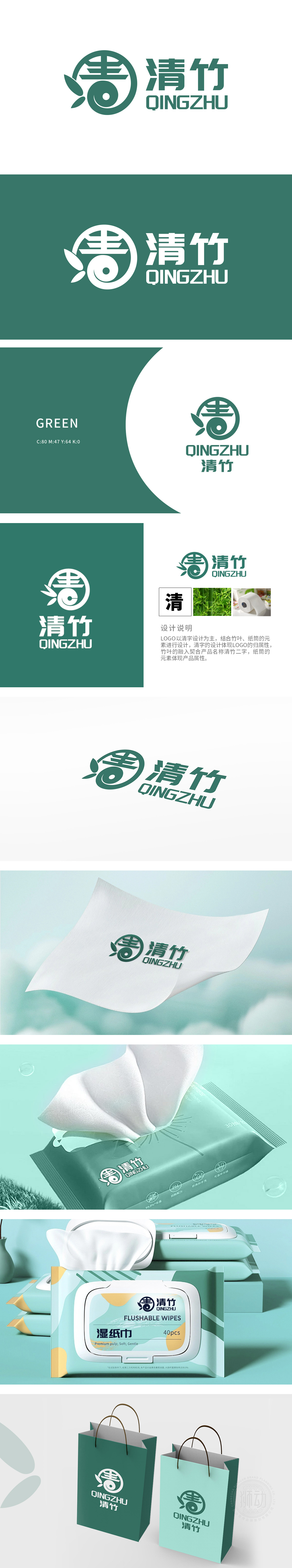
狮动设计以“清”字为核心主体,如利剑破空般直入眼帘。设计师以凌厉的笔锋重构字形结构,将竹叶纹理与纸筒几何形态巧妙熔铸,使“清”字既保留汉字骨韵,又迸发出自然生长的力量感——竹叶脉络在笔画转折处若隐若现,恰似风过竹林时叶片的灵动舒展;纸筒的立体轮廓则赋予字形工业质感的棱角,形成柔与刚、传统与现代的碰撞火花。自然意象与纸品工艺的结合,传递出“清新、可靠、匠心”的品牌气质,直击目标受众的审美与价值认同。
Lion design takes the word "Qing" as the core subject, and it is as straight as a sword. The designer reconstructs the glyph structure with a sharp brush stroke, and skillfully casts the bamboo leaf texture and the geometric shape of the paper tube, so that the word "Qing" not only retains the bone rhyme of Chinese characters, but also expresses the sense of power of natural growth-the bamboo leaf vein looms at the turning point of the stroke, just like the flexible extension of leaves when the wind passes through the bamboo forest; The three-dimensional outline of the paper tube endows the glyph with the edges and corners of the industrial texture, forming a collision spark between softness and rigidity, tradition and modernity.


扫码或拨打添加客服微信


