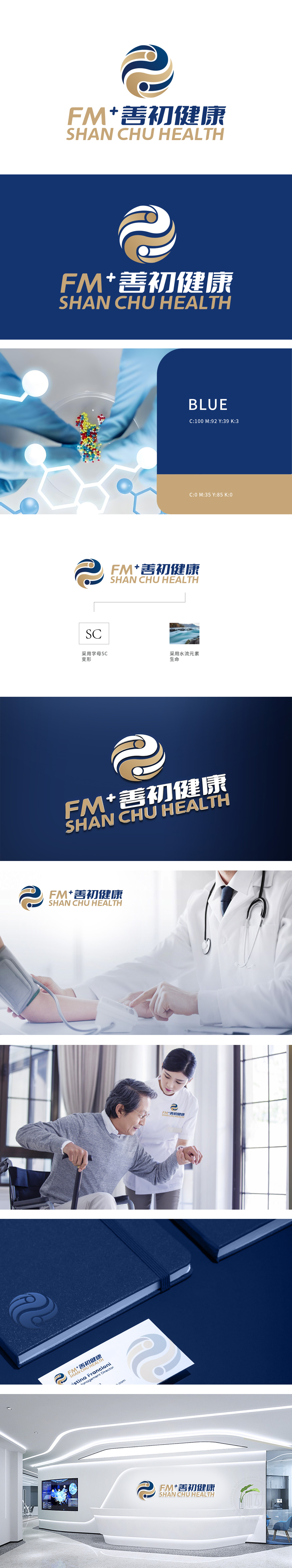
狮动设计采用首字母SC为基底,突破常规字形框架,通过流体力学般的曲线重构,形成动态交织的形态。双重弧形如双手托举生命,象征专业守护与温暖关怀;线条的连续性暗示医疗服务的无缝衔接与持续赋能。金色轮廓与蓝色填充的碰撞,既传递医疗级严谨与科技感,又注入生命力的温度,让品牌记忆点瞬间扎根。以精准的行业洞察为骨,以情感共鸣为血,以差异化视觉为翼,让专业与温度通过视觉直抵人心。
Lion design is based on the initials SC, which breaks through the conventional glyph framework and forms a dynamic interwoven form through hydromechanical curve reconstruction. Double arcs, such as hands holding up life, symbolize professional protection and warm care; The continuity of lines implies the seamless connection and continuous empowerment of medical services. The collision between the golden outline and the blue filling not only conveys the medical-grade rigor and sense of science and technology, but also injects the temperature of vitality, so that the brand memory points can take root instantly.


扫码或拨打添加客服微信


