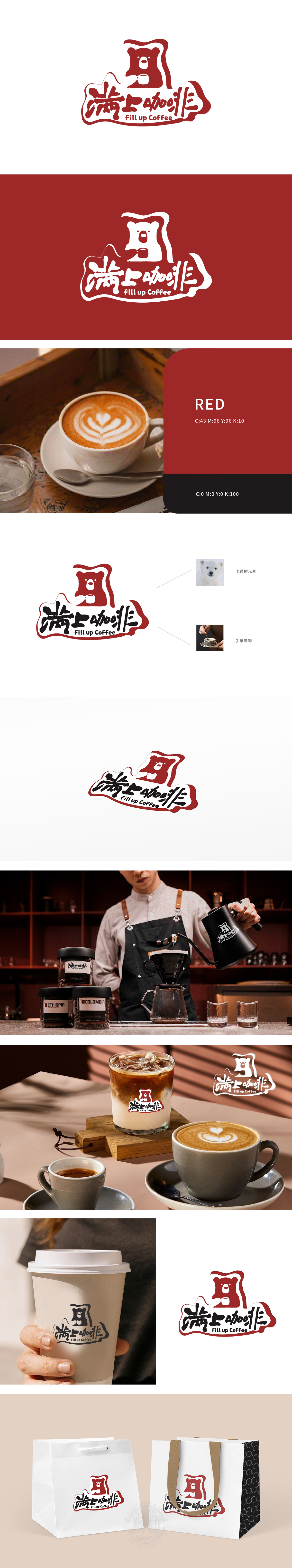
狮动设计以卡通熊首轮廓 为视觉焦点,圆润的线条勾勒出白熊的憨厚萌态,同时巧妙融入手持咖啡杯的剪影——熊爪轻握杯柄,咖啡香气仿佛从杯中袅袅升起,既呼应“满上”的充盈感,又暗藏“手作咖啡”的温度,让品牌瞬间传递出“治愈、亲切、元气满满”的性格。整体以 “拟人化IP+生活化场景” 为切入点,摒弃传统咖啡品牌的高冷或商务感:用诗意语言捕捉Logo中的画面感:熊爪捧杯如掬一捧月光,手写字体的墨韵与咖啡的醇厚交织,让静态设计生出动态故事,传递“一杯咖啡,治愈日常”的品牌主张。
Lion design takes the outline of cartoon bear's head as the visual focus, and the rounded lines outline the simple and cute state of white bear, and at the same time, it is ingeniously integrated into the silhouette of holding a coffee cup-the bear's paw gently holds the handle of the cup, and the coffee aroma seems to curl up from the cup, which not only echoes the fullness of "full top" but also hides the temperature of "hand-made coffee", allowing the brand to instantly convey the character of "healing, kindness and full of vitality". Taking "anthropomorphic IP+ life scene" as the breakthrough point, we abandon the cold or business sense of traditional coffee brands. We capture the picture sense in Logo with poetic language.


扫码或拨打添加客服微信


