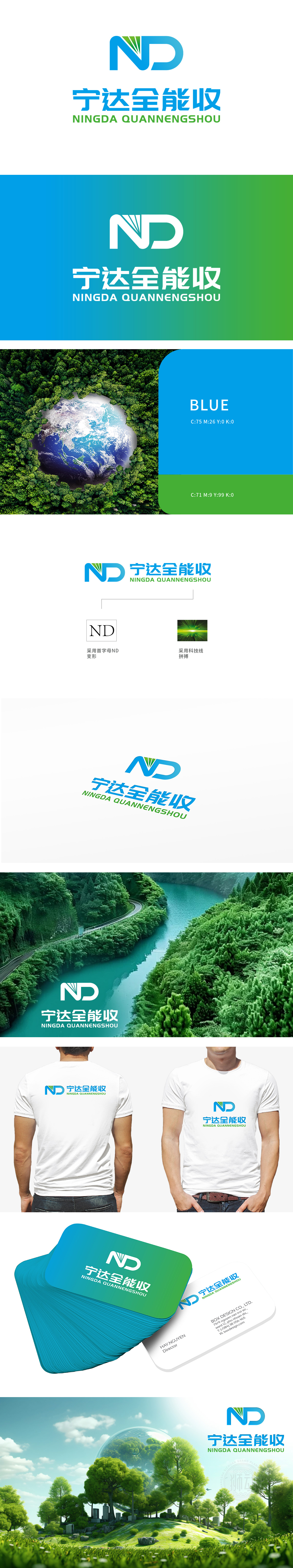
狮动设计以“ND”字母通过放射状线条重构,形似叶片脉络或能量辐射,将自然生命力与科技感融为一体。字母的变形摒弃了传统几何的刻板,以有机形态呼应环保主题,暗示品牌如植物般扎根生态领域,持续生长、释放能量。蓝绿渐变为主色调,蓝色象征纯净、海洋与天空,绿色代表生机、生态与可持续,二者的融合既传递出对自然环境的敬畏,又通过渐变效果暗示了“动态平衡”的环保理念——从自然本源到科技赋能,品牌致力于以创新技术推动环保进程。高对比度的色彩(深绿背景+亮绿光线)形成视觉冲击,传递出“拼搏”的进取精神——品牌以高效、前沿的技术解决环保难题,如利剑般破开行业瓶颈。
Lion design is reconstructed by radial lines with the letter "ND", which looks like leaf vein or energy radiation, and integrates natural vitality with scientific and technological sense. The deformation of letters abandons the rigidity of traditional geometry, echoes the theme of environmental protection in an organic form, suggesting that brands take root in the ecological field like plants, and continue to grow and release energy. Blue and green gradually become the main color, blue symbolizes purity, ocean and sky, and green represents vitality, ecology and sustainability. The integration of the two not only conveys awe of the natural environment, but also implies the concept of "dynamic balance" through the gradual effect.


扫码或拨打添加客服微信


