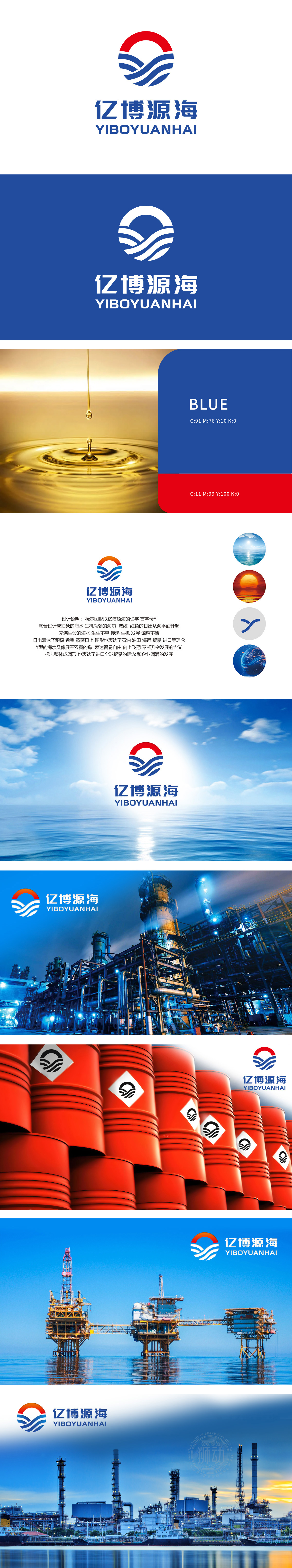
狮动设计以抽象的“Y”字形为核心,通过流畅且极具张力的波浪线条构建,形成强烈的视觉流动感。海浪的起伏形态与红色日出的升腾动态相互呼应,营造出“生生不息”的磅礴气势。线条的粗细渐变与弧度设计,使整体图形在静态中蕴含动态能量,仿佛海浪不断涌动、日出持续攀升,瞬间抓住观者眼球,形成深刻的记忆点。主色调采用深海蓝与炽烈红对比:蓝色象征海洋的深邃、专业与稳健,红色代表朝阳的希望、活力与进取。冷暖色的激烈碰撞不仅增强视觉冲击,更传递出“稳健中迸发活力”的企业精神。将客户提出的“石油、海运、贸易、进口”等理念,通过符号化设计转化为可视化的艺术语言,实现商业属性与美学价值的高度统一。
Lion design takes the abstract "Y" shape as the core of the logo, and forms a strong sense of visual mobility through smooth and extremely tense wavy lines. The ups and downs of the waves echo each other with the rising dynamics of the red sunrise, creating a "endless" majestic momentum. The gradual change of line thickness and radian design make the whole figure contain dynamic energy in static state, as if the waves are surging and the sunrise is rising, which instantly catches the eye of the viewer and forms a deep memory point.The main color is dark blue and fiery red: blue symbolizes the depth, professionalism and stability of the ocean, and red represents the hope, vitality and enterprising of Chaoyang.The fierce collision of cold and warm colors not only enhances the visual impact, but also conveys the enterprise spirit of "being steady and energetic in generate".


扫码或拨打添加客服微信


