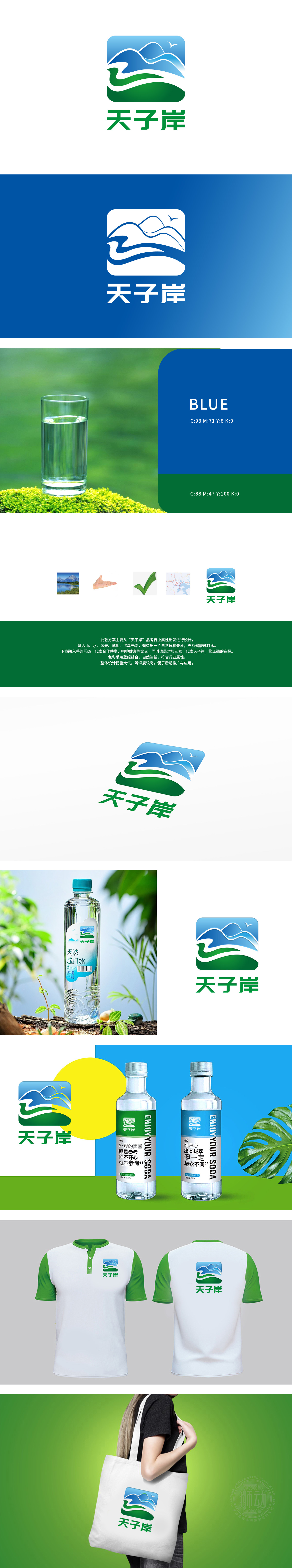
狮动设计融合了山、水、蓝天、草地、飞鸟等自然元素,象征天然与健康,契合矿泉水的属性。手形设计:下方的手形设计寓意合作、共赢与呵护,传递品牌对健康与品质的承诺。色彩选择:蓝绿结合,清新自然,强化了健康与环保的品牌形象。自然元素与手形设计结合,激发消费者对健康生活的向往,增强情感连接。
Lion design combines natural elements such as mountains, water, blue sky, grassland and birds, symbolizing nature and health, and conforming to the attributes of mineral water. Hand design: The hand design below symbolizes cooperation, win-win and care, and conveys the brand's commitment to health and quality. Color selection: blue and green combine, fresh and natural, which strengthens the brand image of health and environmental protection. The combination of natural elements and hand-shaped design stimulates consumers' yearning for a healthy life and enhances emotional connection.


扫码或拨打添加客服微信


