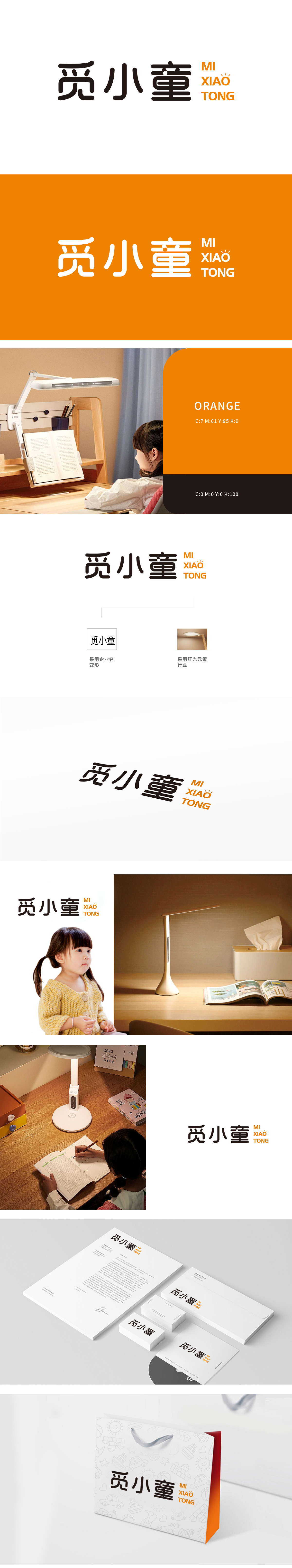
狮动设计将觅”字首笔以弧形勾勒,似光晕扩散的轨迹,暗含“寻找光明”的童趣寓意;“小”字:结构刻意拉伸,形成类似灯柱的形态,稳固而挺拔,传递品牌的专业感;“童”字:末笔巧妙收束为锐角,如灯具的发光焦点,聚焦视觉注意力,点亮品牌记忆点。整体字形如灯光流转的路径,在保持文字识别度的同时,让品牌名称本身成为灯具行业特性的视觉符号。“字形即灵魂,灯具即语言”为核心理念,让每一笔划都传递价值。
The word "lion design will find": the first stroke is outlined in an arc, like the trajectory of halo diffusion, implying the childlike meaning of "looking for light"; The word "small": the structure is deliberately stretched to form a shape similar to a lamp post, which is stable and straight, conveying the professional sense of the brand; The word "child": the final stroke is cleverly bundled into an acute angle, such as the luminous focus of lamps, focusing on visual attention and lighting up brand memory points.The overall glyph, such as the path of light flow, makes the brand name itself a visual symbol of the characteristics of the lighting industry while maintaining the recognition of words.


扫码或拨打添加客服微信


