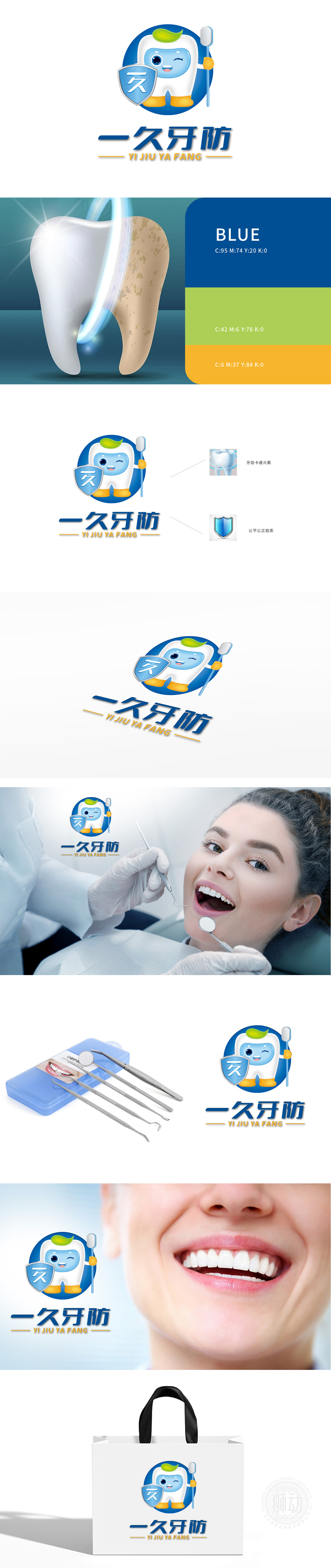
狮动设计采用卡通牙齿突破边框的姿态,牙齿边缘呈现锐利的撕裂效果,如闪电劈开空间,象征品牌打破传统、创新守护的决心。 色彩对冲:牙齿主体以高饱和度蓝+绿渐变(健康/活力),盾牌与牙刷使用纯白+金属灰,形成冷暖、明暗的剧烈碰撞,强化视觉冲击记忆。整体通过夸张形态、对比色彩与多维构图,构建极具穿透力的视觉符号,瞬间抓住受众眼球,传递“一久牙防”的专业守护信任。
Lion design adopts the posture of cartoon teeth breaking through the border, and the edge of teeth presents a sharp tearing effect, such as lightning splitting the space, which symbolizes the brand's determination to break the tradition and innovate.Color contrast: the main body of the tooth is graded with high saturation blue+green (healthy/energetic), and the shield and toothbrush are made of pure white+metal ash, which forms a fierce collision between cold and warm, light and dark, and strengthens the visual impact memory.


扫码或拨打添加客服微信


