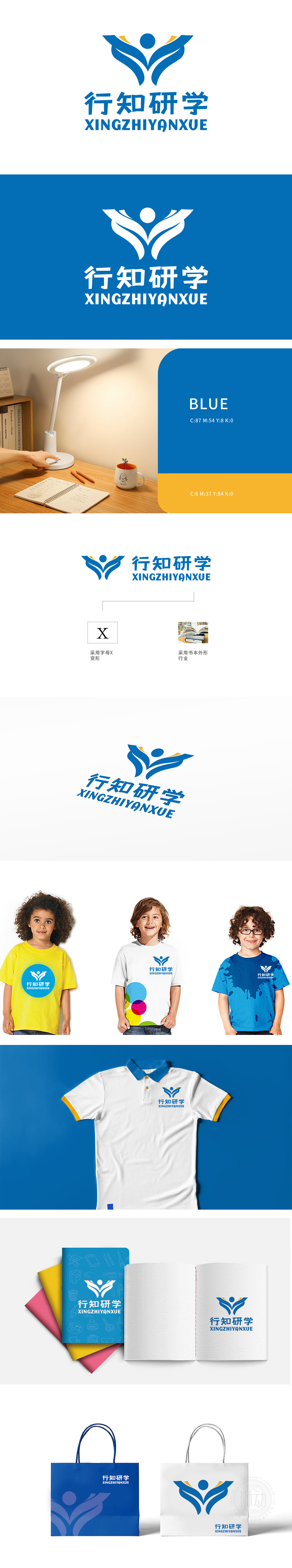
狮动设计以“X”为基因,将其解构为向上伸展的羽翼与书本叠影,象征知识突破边界、探索无限可能。每一处线条的弧度,都暗藏“未知→探索→成长”的教育动线。抽象化的书本轮廓,不仅是教育行业的显性标识,更通过立体切割处理,呈现出翻开书页的动态感——仿佛品牌随时在开启新的认知篇章,与研学旅行“知行合一”的核心价值完美共鸣。让“行知研学”的品牌精神——在行走中求知,在探索中成长——瞬间直抵人心。
Lion design takes "X" as the gene, and deconstructs it into the overlapping of wings and books, which symbolizes that knowledge breaks through the boundary and explores infinite possibilities. The radian of every line hides the educational dynamic line of "unknown → exploration → growth". The abstract book outline is not only the dominant symbol of the education industry, but also the dynamic feeling of opening the pages through three-dimensional cutting-as if the brand is opening a new cognitive chapter at any time.


扫码或拨打添加客服微信


