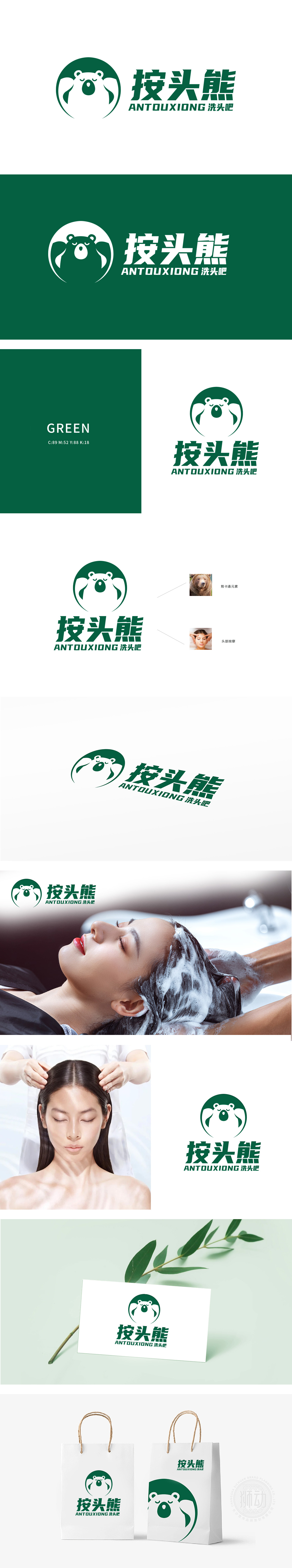
狮动设计以左侧的圆形品牌标识为核心,通过高饱和度的绿色背景与白色线条勾勒的熊头形象形成鲜明对比,瞬间抓住眼球。圆形轮廓的聚焦效应与“按头熊”粗体字体的组合,营造出强烈的视觉锚点,符合“冲击力”的开篇需求。绿色主色调传递自然、健康的品牌调性,而熊头图案的简约几何化处理(如圆润的耳朵、夸张的眼睛)既保留卡通亲和力,又通过线条的锐利转折增强现代感,形成张力平衡。熊的拟人化特征(如双手放置头部的动作)与按摩场景中的服务手势高度契合,直观建立品牌与服务类型的联想。
Lion design takes the circular brand logo on the left as the core, and the image of bear head outlined by high saturation green background and white lines is in sharp contrast, which instantly catches the eye. The combination of the focusing effect of the circular outline and the bold font of "Press the Head Bear" creates a strong visual anchor, which meets the opening requirements of "Impact Force". The main color of green conveys natural and healthy brand tonality, while the simple geometric treatment of bear head pattern (such as rounded ears and exaggerated eyes) not only retains cartoon affinity, but also enhances modernity through sharp turning of lines, forming tension balance.


扫码或拨打添加客服微信


