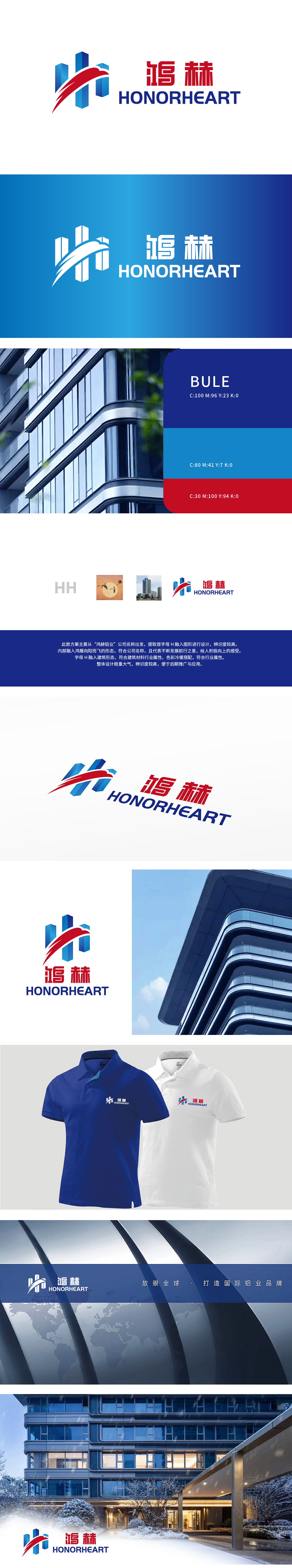
狮动设计以首字母“HH”:提取自公司名称的首字母,简洁明了,辨识度高。鸿雁图案:内部融入鸿雁向阳而飞的形态,象征公司不断前行、积极向上的精神。建筑形态:字母“H”融入建筑形态,契合建筑材料行业的属性,体现专业性。色彩搭配:冷暖结合:色彩冷暖搭配,既稳重大气又不失活力,符合行业特性。整体将现代建筑的冷峻质感与光影变幻融入logo的核心元素,瞬间抓取观者视线。通过立体切割与渐变光影效果,呈现出锐利而通透的冲击力,既象征企业的开放性与行业领先姿态,又以棱角分明的几何线条勾勒出“破界前行”的锐意感。
Lion design with the initials "HH": extracted from the initials of the company name, concise and clear, with high recognition. Hongyan pattern: the internal integration of Hongyan flying to the sun symbolizes the company's continuous progress and positive spirit. Architectural form: the letter "H" is integrated into the architectural form, which conforms to the attributes of the building materials industry and embodies professionalism. Color matching: combination of cold and warm: color matching of cold and warm, which is both stable and energetic, in line with industry characteristics. As a whole, the cold texture and light and shadow changes of modern architecture are integrated into the core elements of logo.


扫码或拨打添加客服微信


