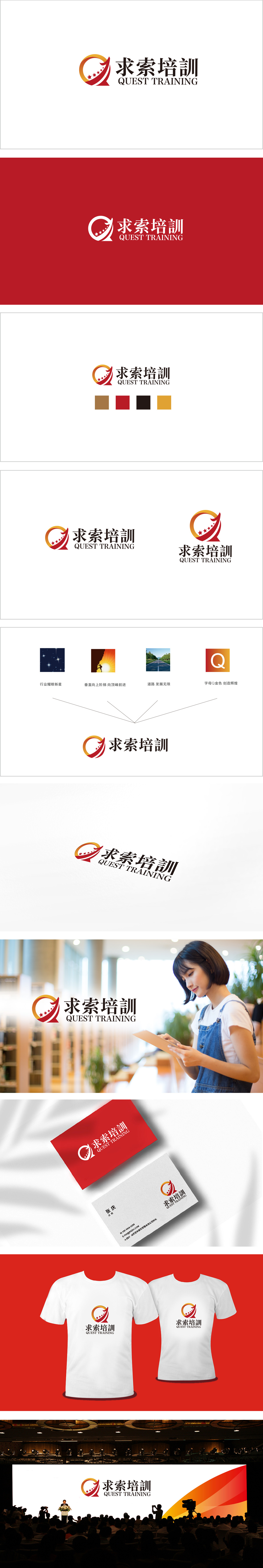
狮动设计采用右上箭头,直接象征“前进”“上升”,对应培训行业“帮助学习者进步”的核心价值。箭头的“倾斜角度”,传递“稳扎稳打、持续成长”的信任感。五颗星星: 沿着箭头方向排列,像“一步步达成的目标”。五颗星的数量是刻意选择的,,暗示培训的“优质性”;渐变圆环(橙→黄): 环绕在箭头外侧,像“探索的轨迹”或“成长的循环”。 充满“动感”(箭头的方向、星星的排列),负责“吸引注意力”,传递“活力与探索”的品牌个性;用“视觉语言”讲了一个让用户有共鸣的故事:“我们陪你一起,一步步探索,一步步成长”。
Lion design adopts the arrow on the right, which directly symbolizes "progress" and "rising", corresponding to the core value of "helping learners progress" in the training industry. The "tilt angle" of the arrow conveys the trust of "steady and steady growth". Five stars: arranged in the direction of the arrow, like "the goal achieved step by step" The number of five stars is deliberately chosen, suggesting the "quality" of training; Graduated ring (orange → yellow): It surrounds the outside of the arrow, like "the track of exploration" or "the cycle of growth". Full of "dynamic" (the direction of the arrow, the arrangement of stars), responsible for "attracting attention" and conveying the brand personality of "vitality and exploration".


扫码或拨打添加客服微信


