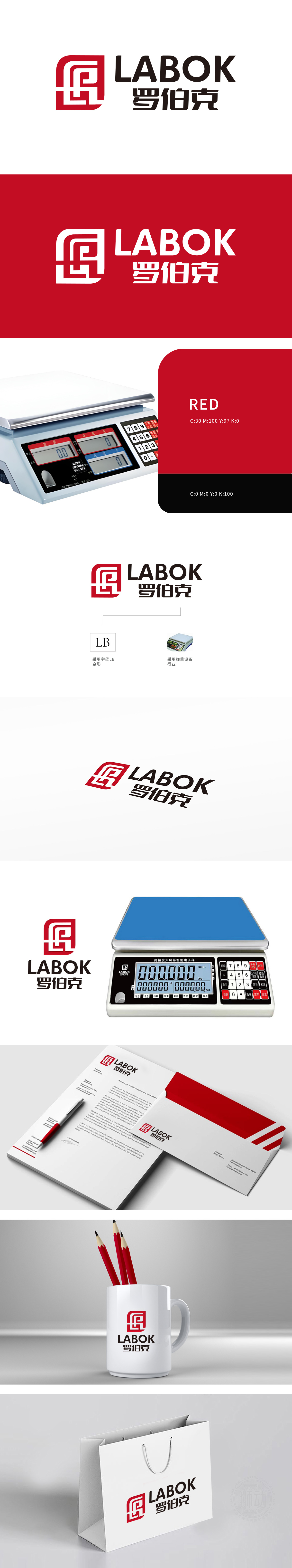
狮动设计将英文“LABOK”采用简洁粗体字,传递科技感与力量感;中文“罗伯克”同步呼应,强化品牌中英文一体化形象,兼顾国际化与本土认知。红色主色调注入活力与专业信赖感,与黑色文字形成对比,提升视觉聚焦效果。整体设计通过线条交织、形态融合,打造独特符号。线条的动态弯曲与精准衔接,既象征称重过程中数据的流动与平衡,又隐喻品牌与行业、客户之间的紧密联结。
Lion design uses English "LABOK" with simple bold characters to convey the sense of science and technology and strength; Chinese "Roboco" echoes synchronously, strengthening the brand image of integration of Chinese and English, taking into account internationalization and local cognition. The main color of red injects vitality and professional trust, which is in contrast with black characters and enhances the visual focusing effect. The overall design creates unique symbols by interweaving lines and merging shapes.


扫码或拨打添加客服微信


