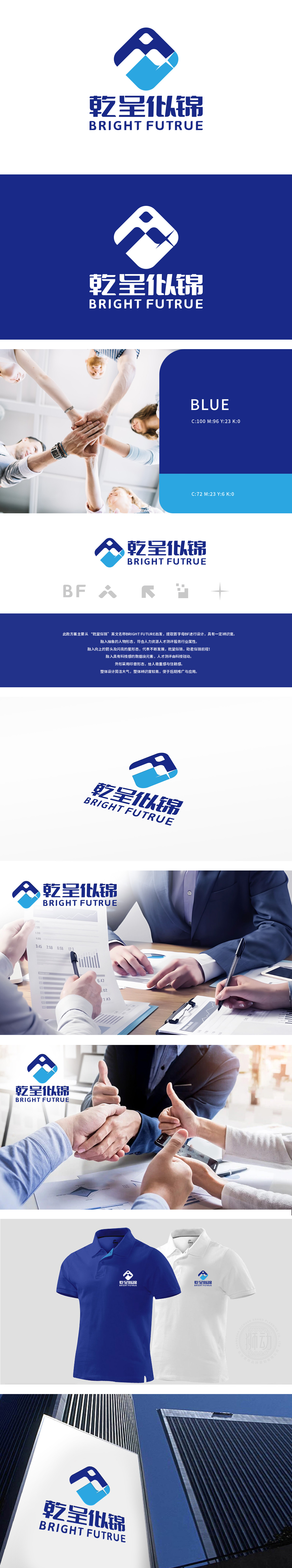
狮动设计基于公司名称“乾呈似锦”及其英文名称“BRIGHT FUTURE”,提取首字母“BF”作为设计核心。视觉元素:抽象人物形态:融入抽象的人物形象,体现人力资源和人才测评服务的行业属性。箭头与星形:加入向上的箭头和闪亮的星形,象征公司不断发展的愿景。数据块元素:融入科技感的数据块,强调人才测评的科技驱动特性。闪耀的星形与科技感数据块交织,迸发出数字化时代的创新火花。整体造型如一枚蓄势待发的能量印章,以不容置疑的视觉重量,奠定品牌在商务咨询领域的权威基调。
Lion Movement team conducted in-depth research on the industry trends and brand concepts, with vibrant orange as the main color, created an embarrassing cartoon bear image, and held a spoon to convey the pleasure of dining. Innovative use of "auspicious | food | bear" separate design, with pinyin to strengthen recognition. Simple and bright visual language fits the light food track accurately, and customers are full of praise for the design ability of Lion Motion's "strategy+creativity" dual drive, calling "this is the soul of our new brand"!


扫码或拨打添加客服微信


