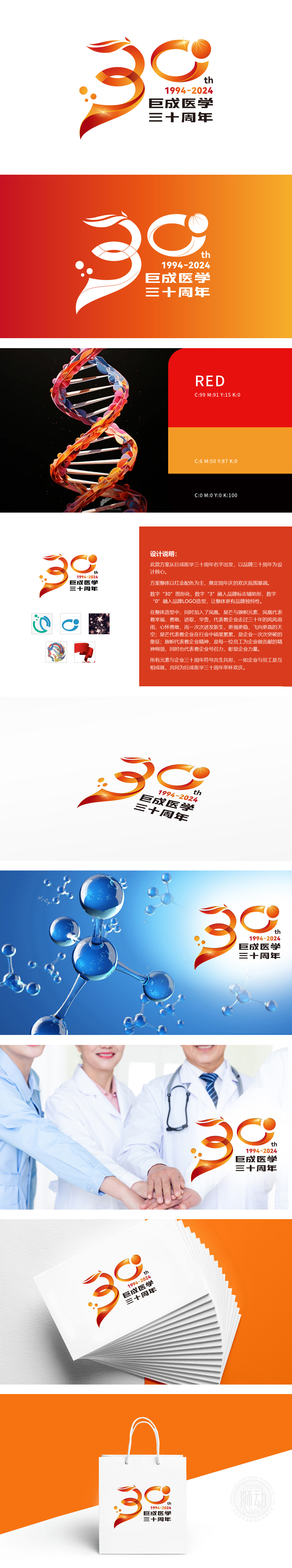
震撼视觉盛宴,巨成医学三十周年品牌灵魂跃然纸上!巨成医学三十周年Logo以红金配色奠定欢庆基调,数字“30”化为品牌灵魂符号:数字“3”融入品牌标志辅助形,如利剑破局;数字“0”与Logo造型共生,似凤凰展翅——历经三十年风雨,企业以凤凰涅槃之势迸发新生,羽翼愈丰,翱翔更高天际!星芒璀璨绽放,象征行业硕果累累;旗帜猎猎,凝聚员工精神与企业号召力。
Shocking the visual feast, the brand soul of the 30th anniversary of Jucheng Medicine is vividly on the paper! The Logo of the 30th anniversary of Jucheng Medical has laid the foundation for celebration with the color matching of red and gold, and the number "30" has been transformed into the brand soul symbol: the number "3" has been integrated into the auxiliary shape of the brand logo, such as the sword breaking; The number "0" coexists with the Logo shape, like a phoenix spreading its wings-after 30 years of wind and rain.


扫码或拨打添加客服微信


