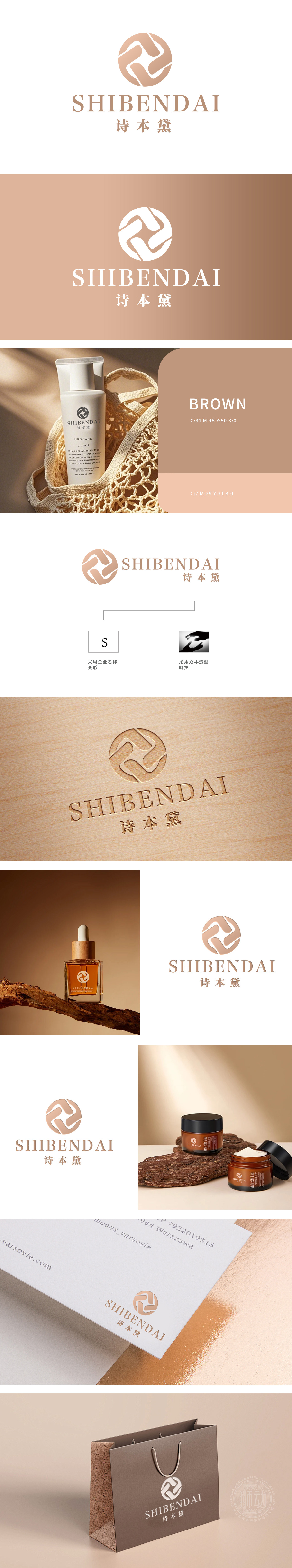
狮动设计由一个变形的“S”字母,代表公司名称的首字母,简洁且具有辨识度。双手造型呵护象征呵护与关爱,传达品牌对用户的贴心服务和高品质保障。采用柔和的棕色调,给人温暖、可靠的感觉,符合日化产品注重温馨与安全的特性。S形抽象符号突破传统框架,线条交织形成动态张力,传递日化产品的现代美学与科技感;双手造型则以光影对比强化视觉锚点,传递“呵护”理念,形成情感与视觉的双重冲击。
Lion design contains a deformed "S" letter, which represents the initials of the company name, which is concise and recognizable. Hands modeling care symbolizes care and care, and conveys the brand's intimate service and high-quality guarantee to users. Soft earthy tones gives people a warm and reliable feeling, which accords with the characteristics of daily chemical products that pay attention to warmth and safety. S-shaped abstract symbols break through the traditional framework, and the lines interweave to form dynamic tension, conveying the modern aesthetics and scientific sense of daily chemical products;


扫码或拨打添加客服微信


