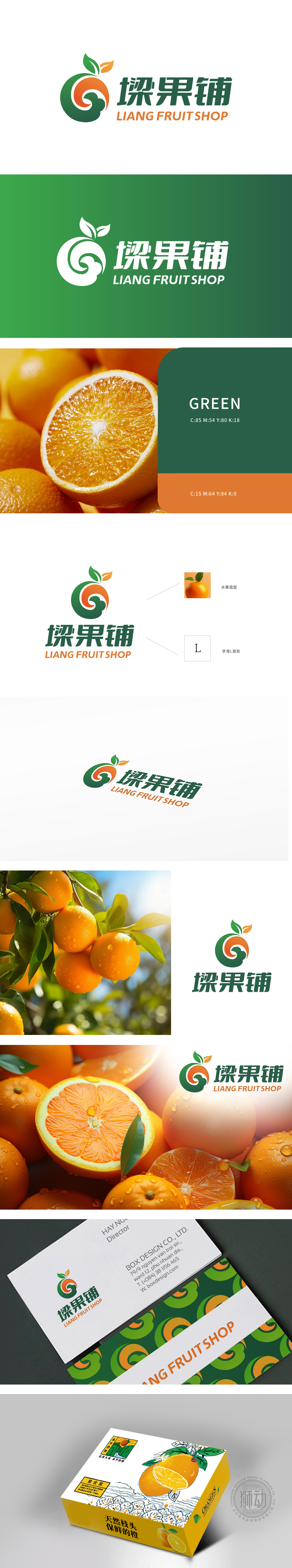
狮动设计融入了橙子的形象,顶部的绿色叶子和橙色果实部分清晰可见,突显了生鲜水果的主题,传达出自然、健康的品牌形象。字母L变形:Logo中的绿色部分巧妙地将字母“L”进行了艺术变形,结合橙子的轮廓,形成独特的视觉效果,增强了品牌识别度。橙绿渐变色调如生鲜水果般迸发活力,橙子造型与字母L的巧妙融合,既强化品牌记忆点,又传递出天然鲜果的蓬勃生命力。简洁线条勾勒出的橙子轮廓,仿佛能嗅到果香扑面而来,完美诠释“生鲜”的感官冲击,彰显狮动设计对品牌核心的精准把控。
Lion design incorporates the image of orange, and the green leaves and orange fruit at the top are clearly visible, which highlights the theme of fresh fruit and conveys a natural and healthy brand image. Distortion of the letter L: The green part of the Logo skillfully distorts the letter "L", combining with the outline of oranges to form a unique visual effect and enhance the brand recognition. The gradual orange-green tone is as energetic as fresh fruit in generate, and the ingenious combination of orange shape and letter L not only strengthens the brand memory.but also conveys the vigorous vitality of natural fresh fruit.


扫码或拨打添加客服微信


