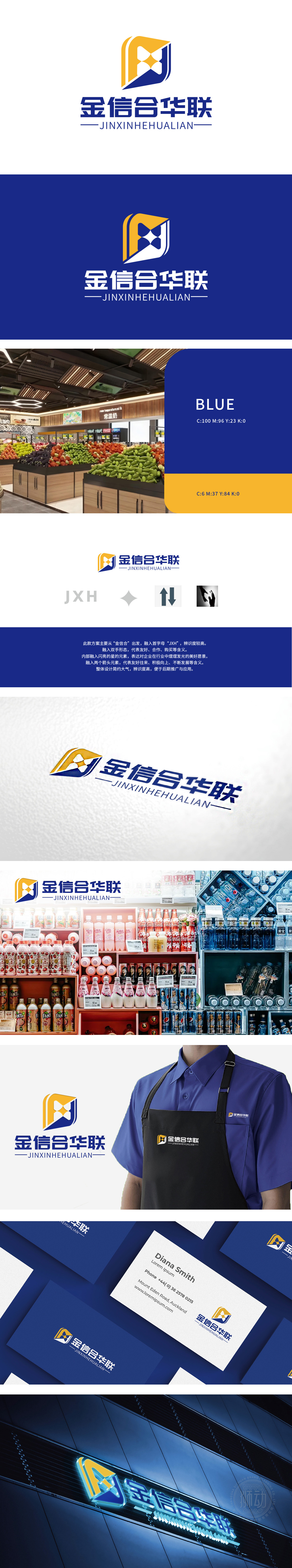
狮动设计以「J」为轮廓框架,融合「X」与「H」的线条张力,蓝黄渐变的盾牌造型既象征百货商超的品质坚守,又暗藏「双手相握」的动态——左手托举(象征服务与托举信任),右手传递(代表合作与消费联结),将「友好、合作、购买」的商业内核融入方寸之间。内部闪耀的星形元素,恰似百货商超中琳琅满目的「明星商品」,亦寓意企业在行业中「熠熠发光」的愿景;双箭头交织向上,「联合共生」,又传递「供需两旺、双向赋能」的蓬勃生机,暗合商超「汇聚好物,链接生活」的本质。以「形」传情,以「意」动人,让冰冷的商业符号化作有温度的品牌语言。
Lion design takes "J" as the outline frame, and integrates the line tension of "X" and "H". The blue-yellow gradual shield shape not only symbolizes the quality persistence of department stores, but also hides the dynamic of "hands clasping"-the left hand lifts (symbolizing service and trust) and the right hand passes (representing the connection between cooperation and consumption), and integrates the business core of "friendship, cooperation and purchase". The star-shaped elements shining inside are just like the dazzling "star goods" in department stores, and also imply the vision of enterprises "shining" in the industry;


扫码或拨打添加客服微信


