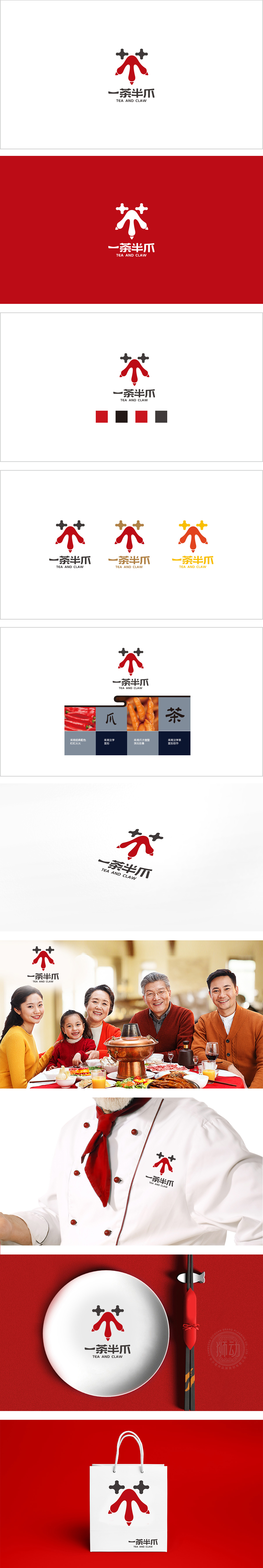
狮动设计以红色“爪形”为视觉核心,搭配两个黑色“十字形”,组合成一个“拟人化的爪”形象——既像凤爪的简化,又像一个“睁着眼睛的小怪兽”,可爱且有记忆点。红色作为餐饮品牌的“流量色”,瞬间抓住注意力,符合“热情、食欲”的餐饮属性。“一茶半爪”采用数字+品类”**的口语化命名,实现“名称→视觉”的统一;配合英文“TEA AND CLAW”,中英文逻辑一致,兼顾中式亲切与国际感。通过“强符号、准定位、细细节”的设计,把“一茶半爪”这个“茶饮+卤味”的组合品牌,变成了一个“有记忆、有情绪、有逻辑”的视觉符号。
Lion design takes the red claw shape as the visual core, and two black crosses are combined to form an anthropomorphic claw image-both like a simplified chicken claw and like a "little monster with eyes open", which is cute and memorable. Red, as the "flow color" of catering brands, instantly catches attention and conforms to the catering attributes of "enthusiasm and appetite". "One Tea and Half Claw" adopts the colloquial name of "number+category" * * to realize the unity of "name → vision"; With English "TEA AND CLAW", the logic of Chinese and English is consistent, taking into account Chinese kindness and international sense.


扫码或拨打添加客服微信


