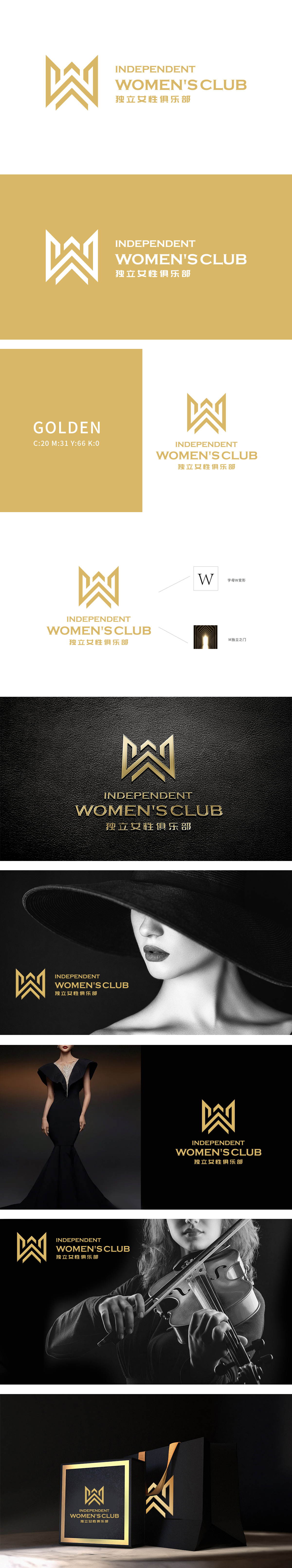
狮动设计将金色的“W”和“M”变形组合而成,形成一个独特的标志。“W”变形:代表“Women”,象征女性。“M”独立之门:设计灵感来源于“M”字母,形似一扇门,寓意“独立之门”,象征女性的独立与自由。金色:象征高贵、优雅和成功,符合女性独立、自信的形象。整体设计以“形”载“意”,将女性独立解码为可视符号,金色光芒更折射出“自我价值”的闪耀本质.
Lion Movement team conducted in-depth research on the industry trends and brand concepts, with vibrant orange as the main color, created an embarrassing cartoon bear image, and held a spoon to convey the pleasure of dining. Innovative use of "auspicious | food | bear" separate design, with pinyin to strengthen recognition. Simple and bright visual language fits the light food track accurately, and customers are full of praise for the design ability of Lion Motion's "strategy+creativity" dual drive, calling "this is the soul of our new brand"!


扫码或拨打添加客服微信


