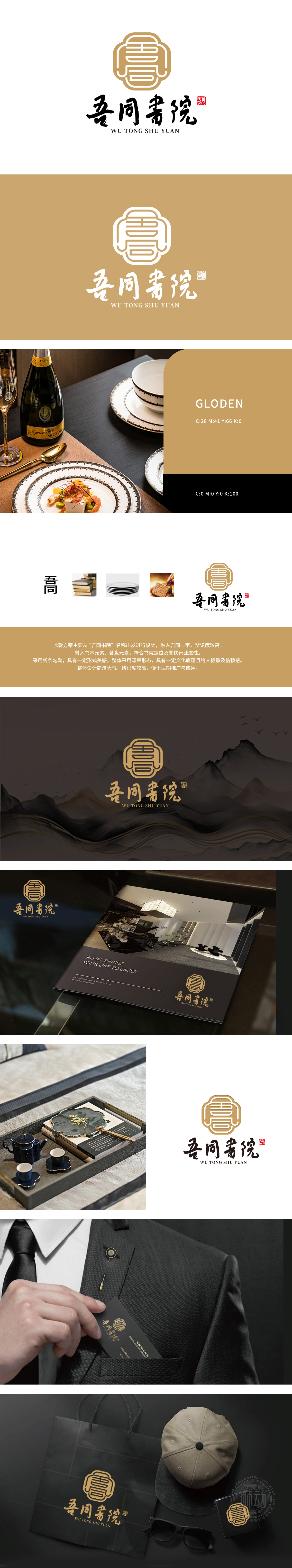
狮动设计以「印」为形、以「字」为骨——上方篆刻形态的图形logo,将「吾」「同」二字解构重组,线条如墨笔挥毫,又似古籍书页翻卷;下方「吾同书院」四字以书法笔触书写,佐以朱红印章点缀,浑然天成一幅「墨香浸餐盘」的东方意境。图形、文字、符号三线交织,既让观者秒懂「这是一家有文化的书院餐厅」,又以极简线条赋予现代审美张力,真正做到「形简意丰,一眼入心」。米金与墨黑的配色,既有「古籍书页」的温暖记忆,又自带「高端雅致」的品质感。
Lion design takes "seal" as the shape and "character" as the bone-the graphic logo in the form of seal cutting above, which deconstructs and recombines the words "I" and "Tong", and the lines are like brush strokes and pages of ancient books. The words "My College" below are written in calligraphy strokes and decorated with vermilion seals, creating an oriental artistic conception of "Mo Xiang immersion plate". The interweaving of graphics, characters and symbols not only makes viewers understand "this is a cultured college restaurant" in a second, but also endows modern aesthetic tension with minimalist lines, truly achieving "simplicity and richness in form, at a glance".


扫码或拨打添加客服微信


