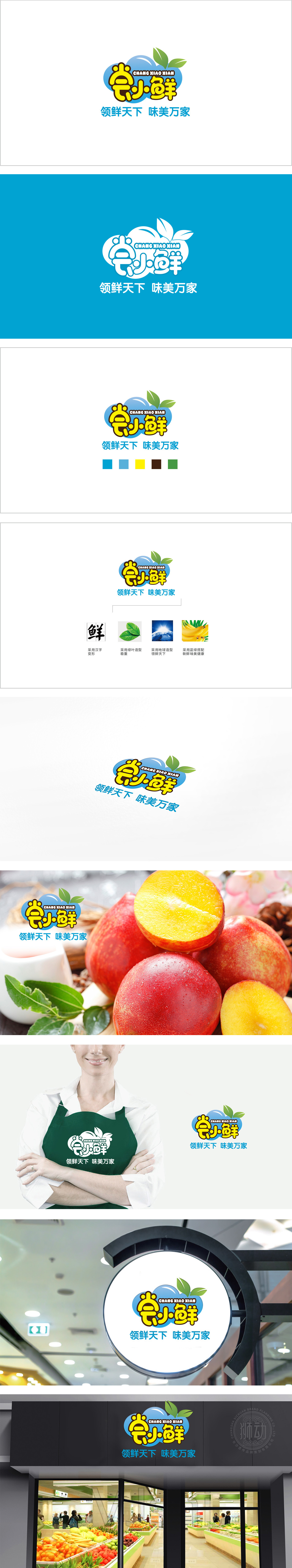
狮动设计通过圆润笔画+具象化联想,将“小”与“鲜”的属性融入字体:“尝”字:被设计成“小皇冠”形状,既增加趣味性,又暗示“尝试新鲜事物”的愉悦感;“小”字:直接对应“小鲜”的“分量适中、适合日常”定位;“鲜”字,既保留“鲜”的本义(鱼+羊=鲜),又通过圆润设计降低距离感;蓝色彩云状轮廓(柔软、轻盈,模拟“新鲜气息”的具象化),选取浅蓝/天蓝色,传递“清新、可靠、冷静”的感受,符合“鲜”需具备的“新鲜度”与“信任感”;黄色:采用高饱和度的亮黄色,搭配深棕轮廓线,既活泼显眼,把“鲜”的味道、温度、记忆,都熬成了视觉的“糖”,一下就撞进了人心里。
Lion design integrates the attributes of "small" and "fresh" into the font through rounded strokes and figurative association: the word "taste" is designed in the shape of "small crown", which not only increases interest, but also implies the pleasure of "trying new things"; The word "small" directly corresponds to the positioning of "small fresh" as "moderate weight and suitable for daily life"; The word "fresh" not only retains the original meaning of "fresh" (fish+sheep = fresh), but also reduces the sense of distance through rounded design; Blue clouds-like outline (soft and light, simulating the concretization of "fresh breath"), light blue/sky blue is selected to convey the feeling of "fresh, reliable and calm".


扫码或拨打添加客服微信


