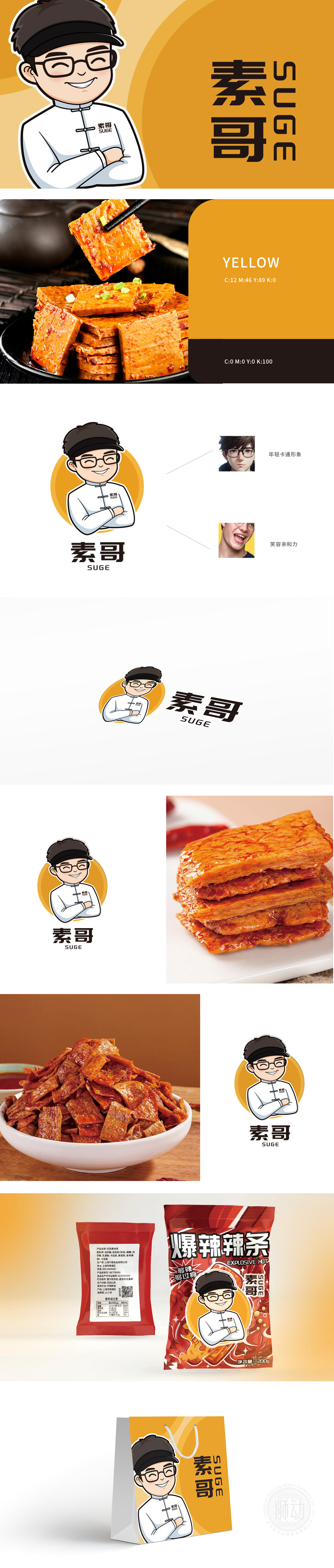
狮动设计采用Q版卡通风格,线条圆润柔和,塑造出戴着黑色发带、眼镜的年轻男性形象——发带的利落线条传递活力,圆框眼镜增添斯文感,微微上扬的眉梢与眯起的笑眼,瞬间拉近与观者距离"素哥"打造的核心视觉符号,以年轻化、亲和力为核心诉求,通过卡通形象传递品牌温度与个性,成为品牌与用户沟通的"第一眼名片"。人物服饰选用纯白色"中式立领+盘扣"设计,简约干净中暗藏东方美学细节,与"素哥"品牌名中的"素"字形成巧妙呼应,传递纯粹、自然的品牌理念。圆形暖橙色背景如同蒸笼升腾的热气,既唤起豆制品"温暖、家常"的味觉联想,又以高饱和色打破传统食品LOGO的沉闷感,增强屏幕上的视觉冲击力。
Lion design adopts Q cartoon style, and the lines are round and soft, creating a young male image wearing black hair bands and glasses-the neat lines of the hair bands convey vitality, while the round-rimmed glasses add a sense of gentleness, slightly raised eyebrows and narrowed eyes, which instantly shorten the distance from the viewer. The core visual symbol created by "Brother Su" takes youthfulness and affinity as the core appeal, and conveys the brand temperature and personality through cartoon images, thus becoming the "first sight" for the brand to communicate with users. The figure costumes are designed with pure white "Chinese-style stand-up collar+buckle", which is simple and clean, hiding oriental aesthetic details, forming a clever echo with the word "Su" in the brand name of "Su Ge" and conveying a pure and natural brand concept.


扫码或拨打添加客服微信


