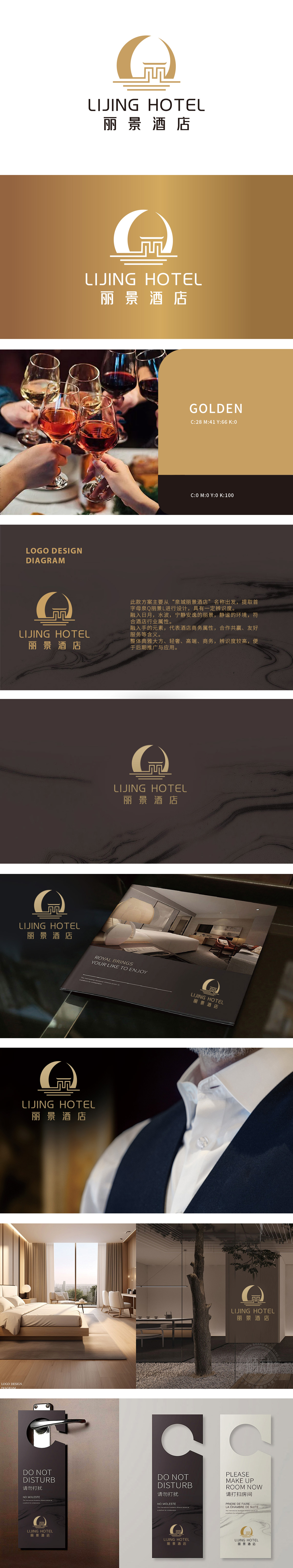
狮动设计提炼首字母“Q”与“L”,以极简线条勾勒出一幅流动的东方画卷:上方圆弧如新月初升,呼应温婉气质,更暗喻酒店如月光般静谧安心的休憩环境;楼阁入画:中部“L”形变体为传统楼阁飞檐,线条硬朗不失典雅,既点明“丽景”主题,又传递酒店商务接待的稳重属性;底部三条横线如泉水轻漾,隐喻酒店服务如水般包容细腻,与“合作共赢”的手形元素(飞檐线条暗藏握手弧度)形成巧妙呼应。整体造型:以“月-楼-水”为轴,金棕色调彰显轻奢质感,线条的曲直相生既符合高端商务的严谨,又饱含东方美学的留白意境。
Lion design refines the initials "Q" and "L", and outlines a flowing oriental picture scroll with minimalist lines: the upper arc rises like a new moon, echoing the gentle temperament, and it is a metaphor for the quiet and peaceful rest environment of the hotel like moonlight; Painting in a Pavilion: the "L" in the middle is a traditional cornice of a pavilion, with tough and elegant lines, which not only points out the theme of "beautiful scenery" but also conveys the sedate attribute of hotel business reception; The three horizontal lines at the bottom are like spring water, which means that the hotel service is as inclusive and delicate as water, and it is ingeniously echoed with the hand-shaped element of "win-win cooperation" (the cornice line hides the radian of shaking hands).


扫码或拨打添加客服微信


