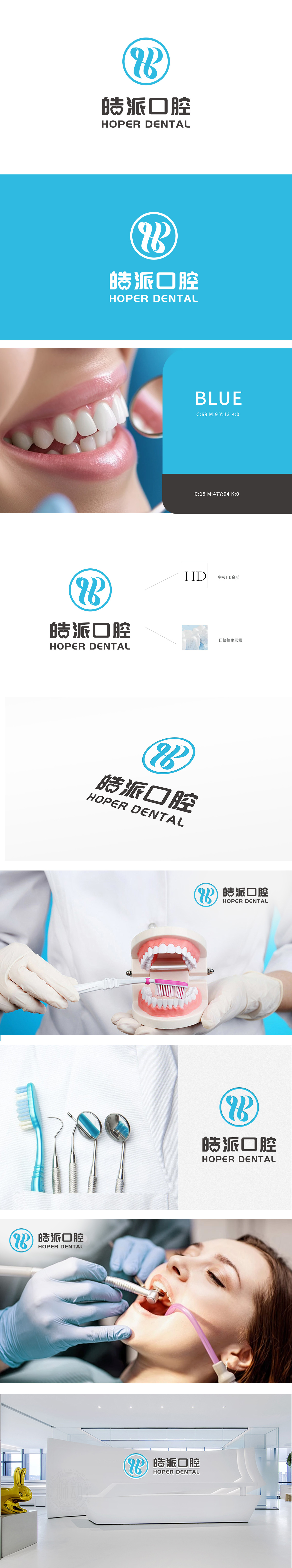
狮动设计以“HB”变形字母:结合了“皓派”(HOPER)的首字母,形成独特的视觉标识,增强品牌记忆点。圆形设计:象征完整与专业,传达出医疗行业的可靠性和全面性。主标识采用「HB」艺术化交织,融合齿形曲线与动态线条,象征精密诊疗与活力服务;「皓派口腔」字体棱角分明,传递专业与信赖感。
The "HB" variant letter of Lion Motion Design: It combines the initials of "HOPER" to form a unique visual logo and enhance the brand memory. Circular design: symbolizes integrity and professionalism, and conveys the reliability and comprehensiveness of the medical industry. The main logo adopts "HB" artistic interweaving, which combines tooth curve and dynamic line, symbolizing precise diagnosis and treatment and energetic service;


扫码或拨打添加客服微信


