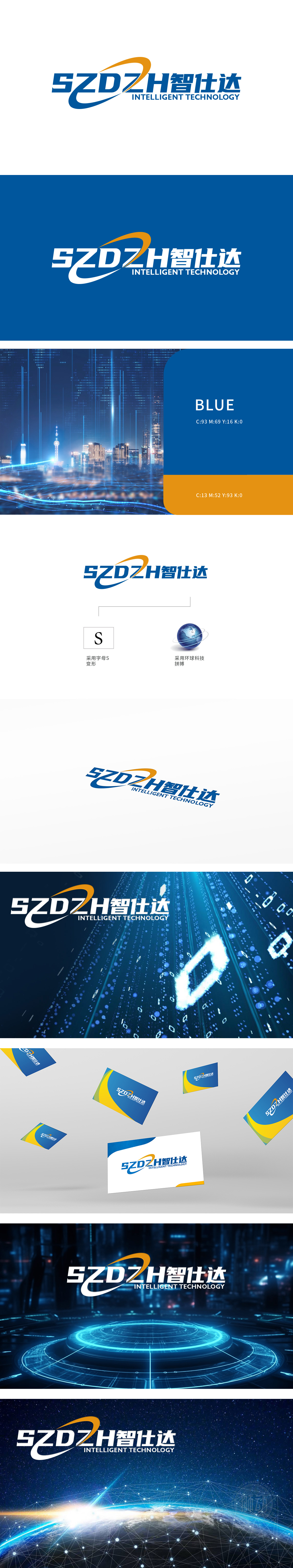
狮动设计以字母曲线的激进变形,形成一道锐利的科技轨迹。橙蓝渐变色如同电流般贯穿,象征着数字时代的高速迭代与创新突破。其动态弧线不仅打破静态框架,更暗喻品牌在科技赛道上的持续跃进,传递出“永不停息的创新动能”。右侧的地球模型以深蓝为基底,经纬线交织成精密的科技网络,环绕的环形轨迹如同数据流的全球脉动。这一设计巧妙回应了“环球科技拼搏”的核心理念,整体设计以“动态S”与“环球经纬”**的双核元素,构筑出一幅跨越时空的科技蓝图。
Lion design forms a sharp scientific and technological track with the radical deformation of letter curve. The orange-blue gradient runs through like a current, symbolizing the high-speed iteration and innovation breakthrough in the digital age. Its dynamic arc not only breaks the static frame, but also implies the brand's continuous leap forward on the science and technology track, conveying "endless innovation kinetic energy". The earth model on the right is based on deep blue, and the latitude and longitude are interwoven into a precise scientific and technological network, and the circular trajectory around it is like the global pulse of data flow.


扫码或拨打添加客服微信


