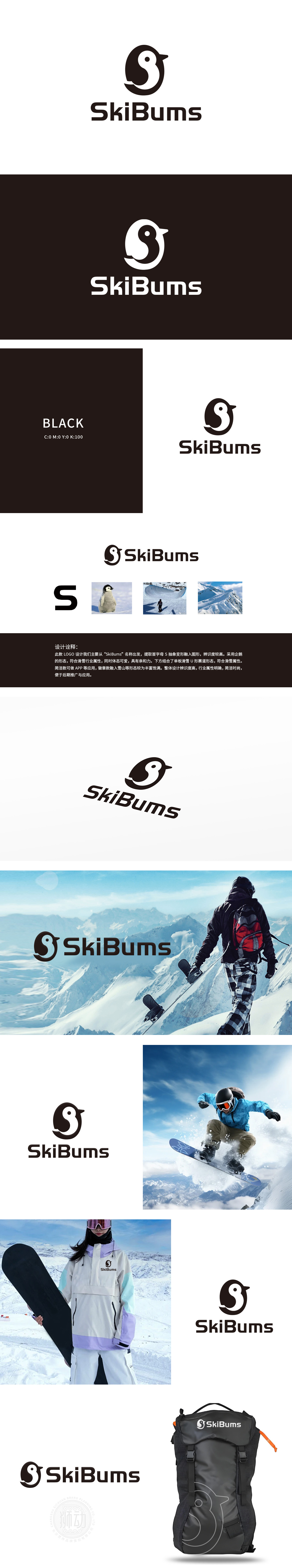
狮动设计提取首字母 S 作为核心视觉元素,将字母 S 抽象变形,融入企鹅的形态。企鹅形象不仅符合滑雪行业的属性,设计中结合了单板滑雪的 U形赛道 形态,进一步强化了滑雪运动的主题,使LOGO具有明确的行业指向性。企鹅憨态可掬的体态与滑雪运动的激情碰撞,传递出专业与亲和力的双重品牌特质。
Lion design extracts the initial letter S as the core visual element, and transforms the letter S abstractly into the shape of a penguin. Penguin image not only conforms to the attributes of skiing industry, but also combines the U-shaped track shape of snowboarding in the design, which further strengthens the theme of skiing and makes LOGO have a clear industry orientation. Penguin's naive posture collides with the passion of skiing.


扫码或拨打添加客服微信


