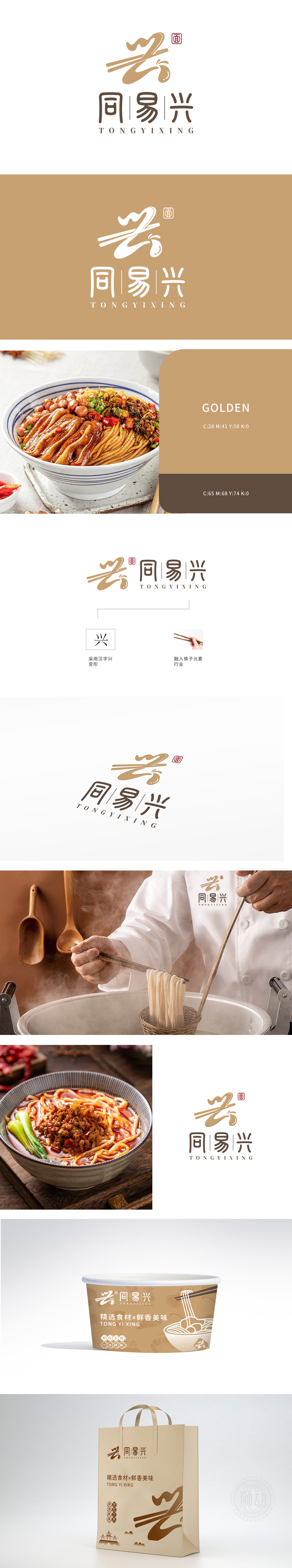
狮动设计采用以筷子与"兴"字的灵魂碰撞,将"筷子"这一餐饮核心工具抽象化,以流畅的金色笔触勾勒出夹面时的动态曲线,末端自然晕染成一滴酱汁形态,暗藏"滋味悠长"的味觉联想。"色调选用大地金与深棕配色,金如麦浪、棕似木桌,既有食材本真的温暖质感,又符合高端中式餐饮的沉稳调性,避免传统红色系的视觉疲劳文化为根,让品牌自带"烟火气"。
Lion design uses chopsticks to collide with the soul of the word "Xing", abstracting the "chopsticks" as the core tool of catering, sketching the dynamic curve when the noodles are sandwiched with smooth golden strokes, and the end naturally faints into a drop of sauce, which hides the taste association of "long taste". "Earth gold and dark brown are selected for color matching, and gold is like a wheat wave and brown is like a wooden table.


扫码或拨打添加客服微信


