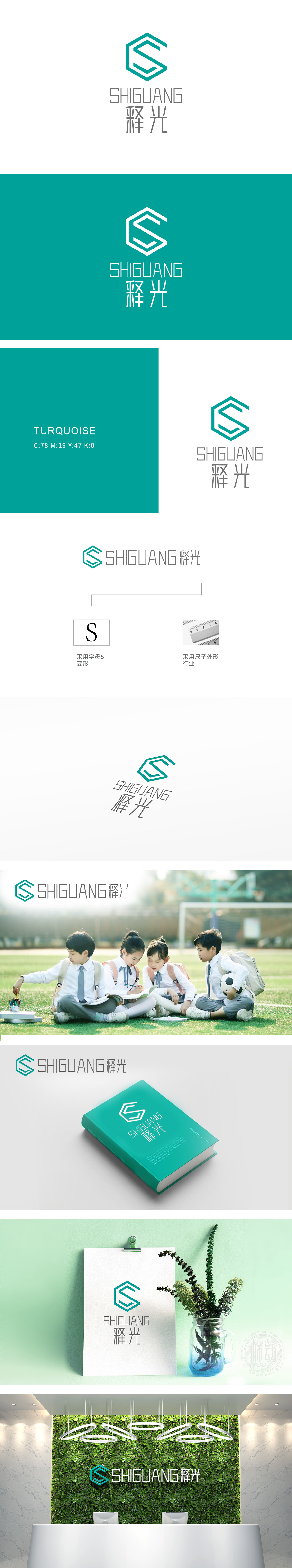
狮动设计以品牌首字母“S”为创意原点,通过六边形几何切割与流线型折角重构,既保留字母识别度,又形成“打开书本”“延伸知识”的动态联想。青蓝色调传递专业、理性与智慧感,匹配教育行业的信任感需求。尺子元素的隐形植入,以极简线条暗合教育行业“度量成长、精准培育”的内核,避免直白符号的生硬,让行业属性在细节中自然流露。汉字“释光”以笔触优化结构,传递“释放光芒、启迪未来”的品牌理念,整体实现“形简意丰”的视觉张力。
Lion design takes the brand initials "S" as the creative origin, and through hexagonal geometric cutting and streamlined corner reconstruction, it not only retains the letter recognition, but also forms a dynamic association of "opening books" and "extending knowledge". Blue tones convey professionalism, rationality and wisdom, and match the trust needs of the education industry. The invisible implantation of ruler elements coincides with the core of "measuring growth and precise cultivation" in the education industry with minimalist lines, avoiding the blunt symbols and letting the industry attributes naturally reveal in the details.


扫码或拨打添加客服微信


