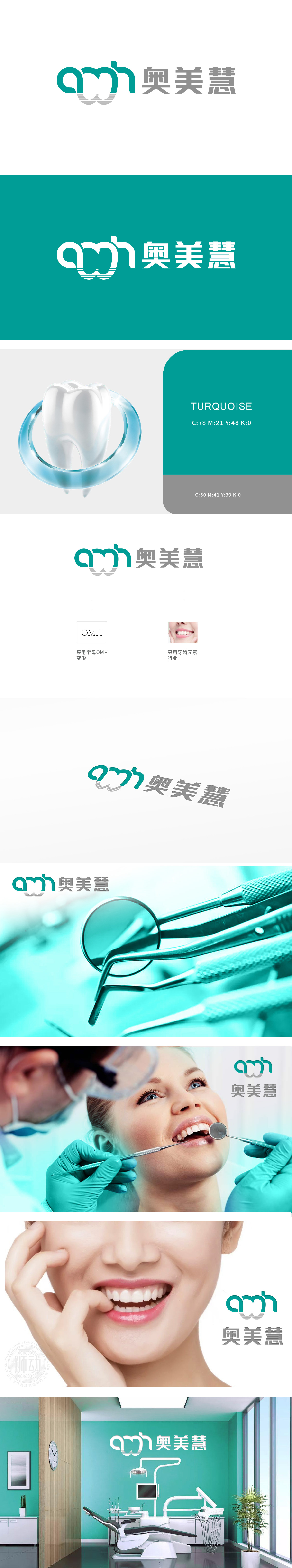
狮动设计采用了“OMH”三个字母的变形设计,通过艺术化的处理,使字母组合形成一个独特的视觉符号。巧妙地融入了牙齿的元素,具体表现为字母“O”和“M”的设计形态类似于牙齿的排列。简洁的几何变形,既彰显品牌专业性,又通过明亮色调传递健康与活力。牙齿图案的巧妙嵌入,强化品牌与口腔护理的强关联,瞬间捕获目标客户群。
Lion design adopts the deformation design of "OMH" three letters, and through artistic treatment, the letters are combined to form a unique visual symbol. Ingeniously incorporates the elements of teeth, which is embodied in the design form of letters "O" and "M" similar to the arrangement of teeth. Simple geometric deformation not only shows brand professionalism, but also conveys health and vitality through bright colors. Ingenious embedding of tooth patterns strengthens the strong connection between brand and oral care, and instantly captures the target customer base.


扫码或拨打添加客服微信


