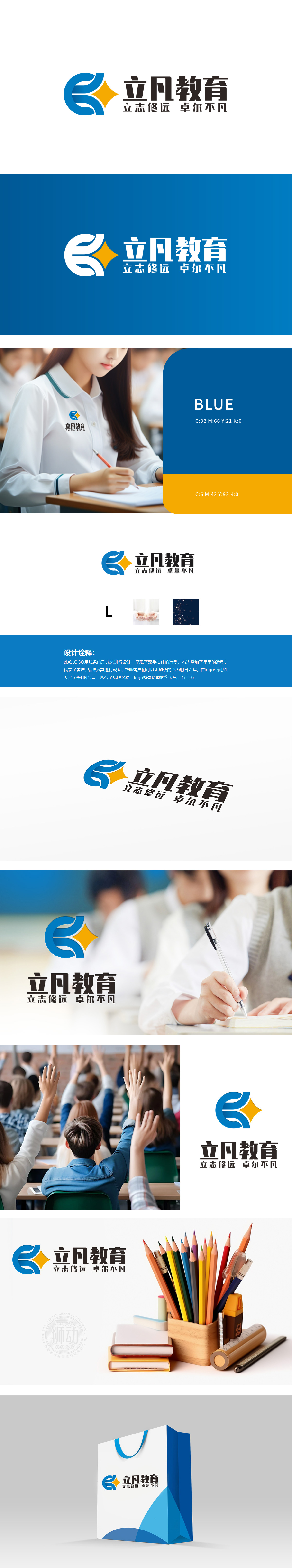
狮动设计采用字母“L”的造型,直接呼应了“立凡”品牌名称,增强了品牌识别度。以线条形式设计,呈现了“双手捧住”的造型,象征着呵护、支持与传递,体现了教育行业对学生的关爱与培养,加了星星的造型,代表了客户(即学生),寓意品牌为其进行规划,帮助他们成为“明日之星”。这不仅突显了教育的前瞻性,也表达了对学生成长的美好期望。立凡教育LOGO以双手托举学子成长之路,以星辰指引卓越之路,彰显“立志修远 卓尔不凡”的教育初心。
Lion design adopts the shape of the letter "L", which directly echoes the brand name of "Lifan" and enhances the brand recognition. The design in the form of lines presents the shape of "holding with both hands", symbolizing care, support and transmission, reflecting the care and training of students in the education industry, and adding the shape of stars to represent customers (that is, students), implying that brands plan for them and help them become "stars of tomorrow". This not only highlights the forward-looking nature of education, but also expresses good expectations for students' growth. Lifen Education LOGO supports students' growth path with both hands.


扫码或拨打添加客服微信


