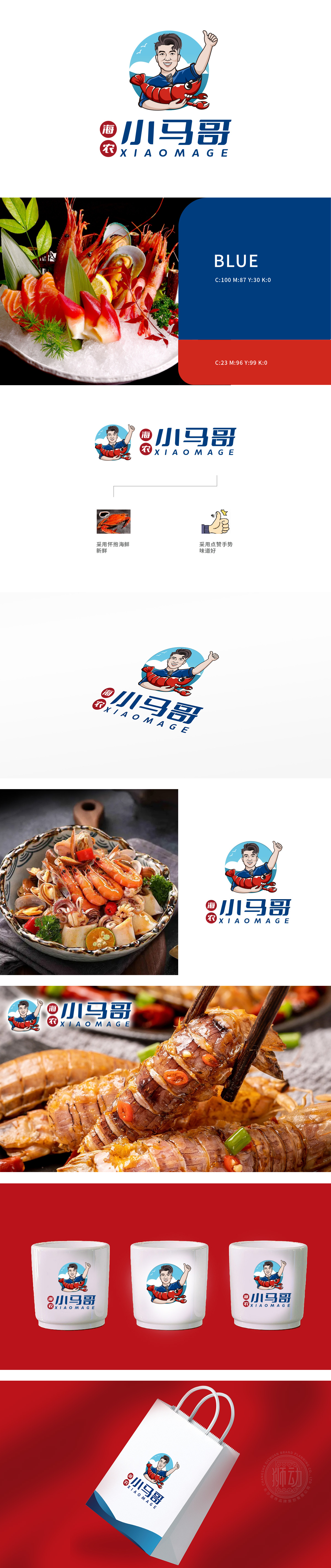
狮动设计采用生动形象的卡通人物形象,手持小龙虾,传达出公司与海鲜美食的紧密联系。人物做出点赞手势,传递出对产品品质的自信和对顾客的友好态度。主要采用蓝色和红色,蓝色象征专业和信任,红色则传递热情和活力。“小马哥”字体粗犷有力,英文“XIAOMAGE”简洁现代,整体风格活泼且具有亲和力。狮动设计团队以海鲜为核心意象,将食材的新鲜质感与味觉的极致享受凝练为视觉符号,不仅构建了品牌与海洋的天然联结,更以巧妙的手势互动传递出消费者对品质的由衷认可。
Lion design adopts vivid cartoon characters and holds crayfish, which conveys the close relationship between the company and seafood. People make praise gestures, conveying confidence in product quality and friendly attitude towards customers. Blue and red are mainly used. Blue symbolizes professionalism and trust, while red conveys enthusiasm and vitality. The font of "Mark" is rough and powerful, and the English word "XIAOMAGE" is concise and modern, with lively overall style and affinity.


扫码或拨打添加客服微信


