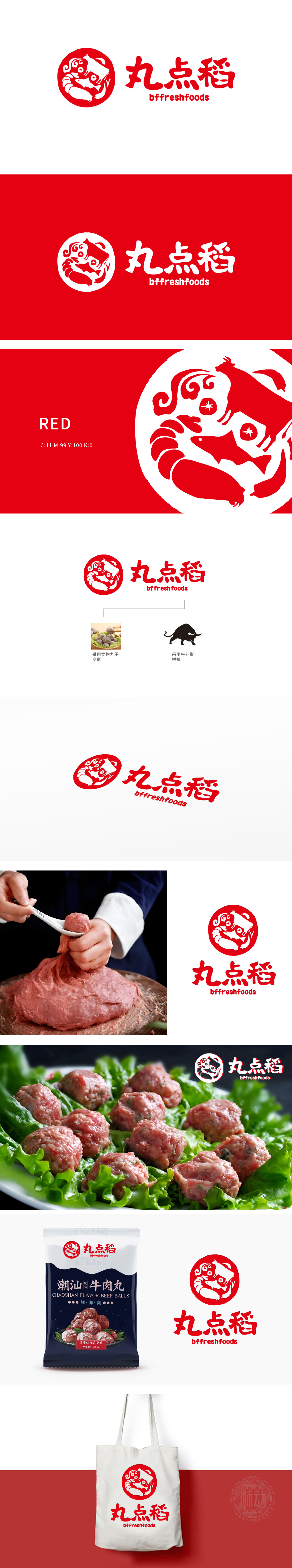
狮动设计以多个圆润、堆叠的“丸子”形态为基础(,线条柔和饱满,直接关联品牌名称中的“丸”字,突出核心产品属性(如肉丸、食材等),传递新鲜、软糯的食物质感。圆形徽章采用正红色,寓意热情、吉祥,符合食品行业传递食欲与信任感的视觉需求,圆形徽章采用正红色,寓意热情、吉祥,通过巧妙的元素重组,实现了“产品属性+品牌价值”的双重表达,兼具识别性与内涵深度。
Lion design is based on a number of round and stacked "meatballs" (the lines are soft and full, which directly relate to the word "meatballs" in the brand name, highlight the core product attributes (such as meatballs, ingredients, etc.), and convey the fresh and soft food texture. The round badge is red, which means enthusiasm and auspiciousness, and meets the visual needs of the food industry to convey appetite and trust. The round badge is red, which means enthusiasm and auspiciousness.


扫码或拨打添加客服微信


