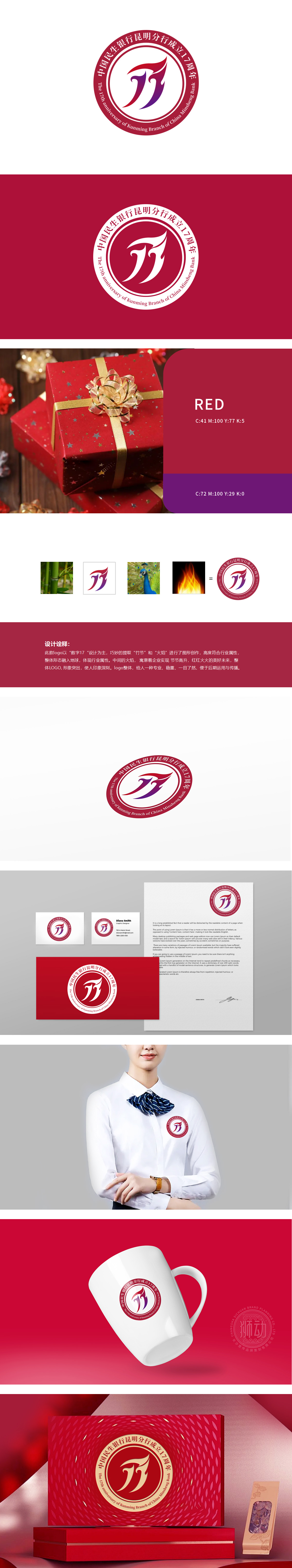
狮动设计采用数字17:作为设计的核心,巧妙融入图形中。竹节:象征企业的坚韧与成长。火焰:寓意企业的发展蒸蒸日上,充满活力。中间的火焰元素,寓意企业实现“节节高升,红红火火的美好未来”。数字形态如破竹之势,象征企业稳健成长;火焰元素跃动其间,寓意光明未来。整体以“地球”为底,彰显行业格局与全球视野,红金配色更添庄重质感。
Lion design uses the number 17: as the core of the design, cleverly integrated into the graphics. Bamboo joint: symbolizes the tenacity and growth of enterprises. Flame: It means that the development of the enterprise is flourishing and full of vitality. The flame element in the middle means that the enterprise will realize "a bright future of rising steadily and flourishing". The digital form is like a broken bamboo, symbolizing the steady growth of enterprises; The flame element jumps in the meantime, meaning a bright future.


扫码或拨打添加客服微信


