狮动为忙果咨询设计的品牌logo,以蓝色为主色调传递专业与信赖感。左侧不规则四边形,象征多元咨询服务的动态交织与持续创新;线条的简洁流畅性,则呼应忙果咨询高效精准的服务理念。右侧中英文品牌名称的布局强化了国际化定位。设计过程中,狮动团队深度调研行业特性与客户需求,将战略咨询的智慧沉淀与前瞻思维转化为视觉符号,显著提升了品牌辨识度与市场影响力。
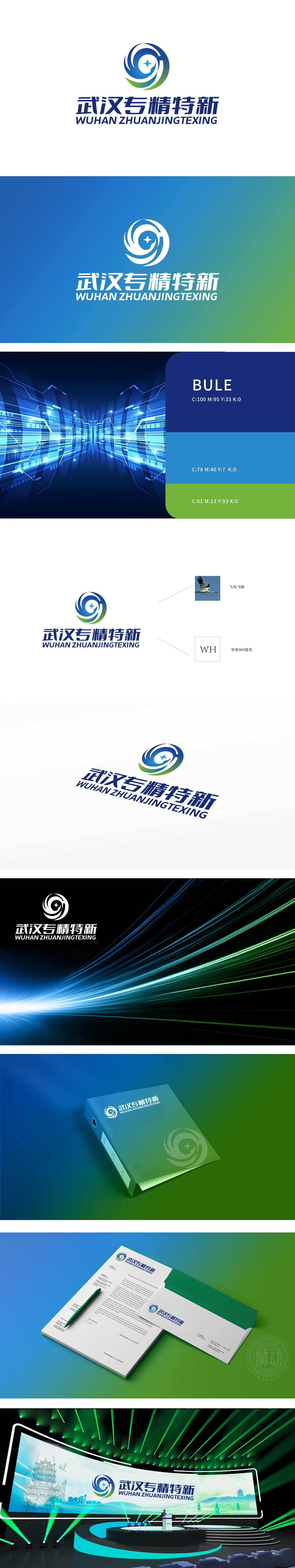
When Wuhan Specialized Lion Movement created the iconic LOGO for the "Wuhan Specialized and Unique" industrial cluster, it deeply dismantled the core of "specialization, refinement, characteristics and novelty". LOGO carries the image of industrial ecological integration with a fluid sense circle, and the technology blue and vitality green gradually interpret
the innovation vitality and real economic toughness; The central star is not only the concrete expression of "the leader of specialized track", but also the metaphor of "technical breakthrough singularity"; Surrounding lines are like data streams, such as the potential energy of industrial upgrading, which dispels the stereotype of traditional signs.


扫码或拨打添加客服微信


