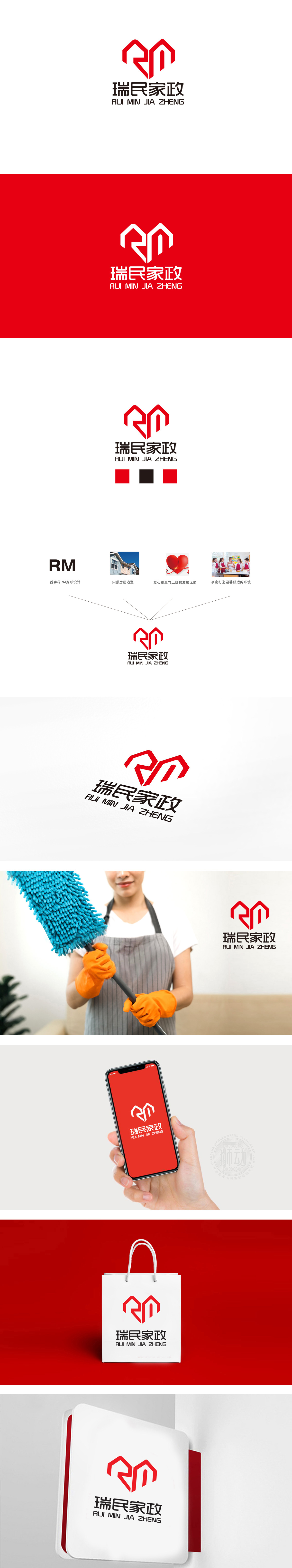
狮动设计将“RM”字母变形与“房屋轮廓”结合,左右对称的线条既像房屋的屋顶,又融入了“爱心”的弧度,整体呈向上汇聚的形态,强化“阶梯发展”的成长感与“守护家”的安全感。整体设计将“RM+房屋+爱心”的融合设计,既简洁现代,又赋予品牌情感温度,也暗示服务品质的持续升级,让客户感受到专业与可靠,符合用户对家政服务“可靠、贴心、不断优化”的期待。
Lion design is a combination of "RM" letter deformation and "house outline". The symmetrical lines are both like the roof of the house and incorporate the radian of "love", and the whole is in the form of upward convergence, which strengthens the sense of growth of "step development" and the sense of security of "guarding home". The overall design combines the design of "RM+ house+love", which is not only concise and modern, but also gives the brand emotional temperature, and also implies the continuous upgrading of service quality.


扫码或拨打添加客服微信


