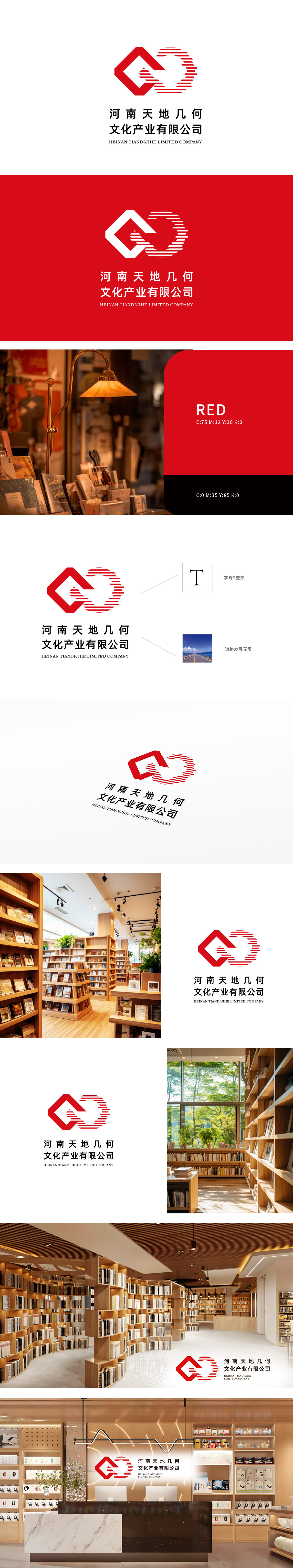
狮动设计将公司名称中的“天地”首字母“T”进行解构,以动态线条与几何块面重组,形成兼具力量感与流动性的视觉锚点。红色渐变色块如“文化火种”层层叠加,既呼应中原大地的厚重底蕴,又以现代设计语汇打破传统桎梏。道路延伸”图案并非简单装饰,而是构建了一个“文化出海”的视觉隐喻。笔直道路象征公司稳健的发展脉络,尽头处海天相接的弧线,暗示文化服务的无限边界以红色几何美学重构“文化”的无限可能!
Lion Design deconstructs the initial letter "T" of "Heaven and Earth" in the company name, and recombines dynamic lines and geometric blocks to form a visual anchor point with both strength and fluidity. The red gradient blocks, such as "cultural fire", are superimposed layer by layer, which not only echoes the rich background of the Central Plains, but also breaks the traditional shackles with modern design vocabulary. The road extension pattern is not a simple decoration, but a visual metaphor of "culture going out to sea".


扫码或拨打添加客服微信


