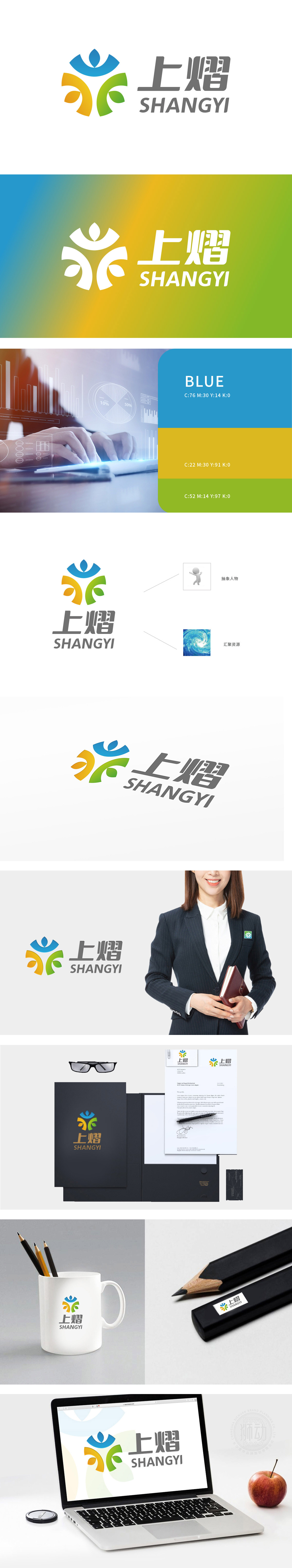
狮动设计由三个抽象的花瓣状图形组成,分别采用蓝色、黄色和绿色,象征着自然、活力和希望。三色箭头(蓝、橙、绿)向上延伸,象征企业突破边界、持续增长的雄心;抽象人物与汇聚资源的图案,则暗喻团队协作与资源整合的智慧。狮动通过这种简洁而深刻的图形语言,不仅强化了品牌的辨识度,更传递出“以设计驱动商业价值”的核心理念。
Lion design consists of three abstract petal-shaped figures, blue, yellow and green respectively, symbolizing nature, vitality and hope. The tricolor arrows (blue, orange and green) extend upward, symbolizing the enterprise's ambition to break through the border and continue to grow; Abstract figures and patterns of gathering resources are a metaphor for the wisdom of teamwork and resource integration. Through this concise and profound graphic language, Lion Motion not only strengthens the brand recognition, but also conveys the core concept of "design drives business value".


扫码或拨打添加客服微信


