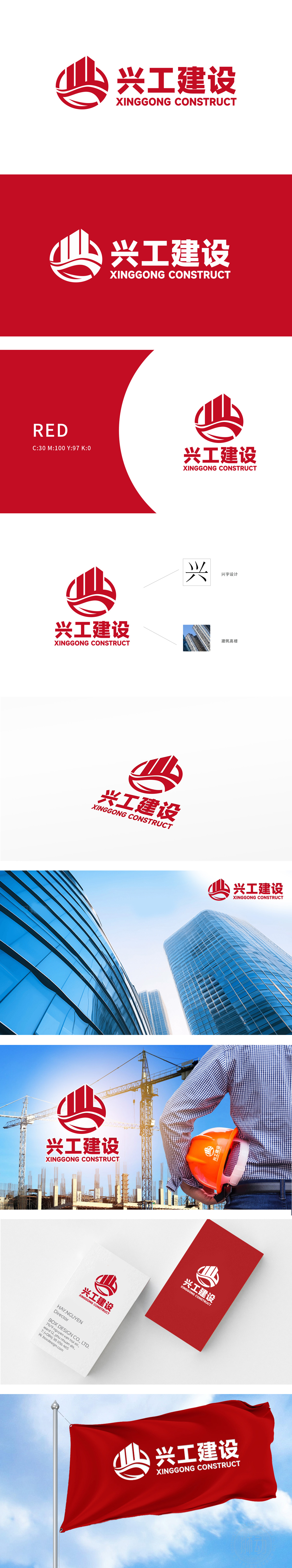
狮动设计基于红色为主色调,圆形结构内嵌山峰、桥梁与水流元素,形成极具张力的视觉焦点。山峰线条硬朗,象征建筑的稳固与雄伟;桥梁弧线流畅,寓意连接与创新;水流波纹动态延伸,传递生命力与可持续发展理念。红色圆形既强化品牌识别度,又传递权威与热情。Logo通过“山、桥、水”三元素,隐喻“根基稳固(山)、连接未来(桥)、持续发展(水)”的品牌使命。配合“XINGGONG CONSTRUCT”英文字体的现代感,形成传统与创新设计的融合形象,精准定位目标客户对“实力+创新”的双重需求。
Lion design takes red as the main color, and the circular structure is embedded with peaks, bridges and water elements, forming a very tense visual focus. The peak lines are tough, symbolizing the stability and grandeur of the building; Bridge arc is smooth, which means connection and innovation; The water ripple extends dynamically, conveying vitality and the concept of sustainable development. The red circle not only strengthens brand recognition, but also conveys authority and enthusiasm. Logo, through the three elements of "mountain, bridge and water", symbolizes the brand mission of "solid foundation (mountain), connecting the future (bridge) and sustainable development (water)".


扫码或拨打添加客服微信


