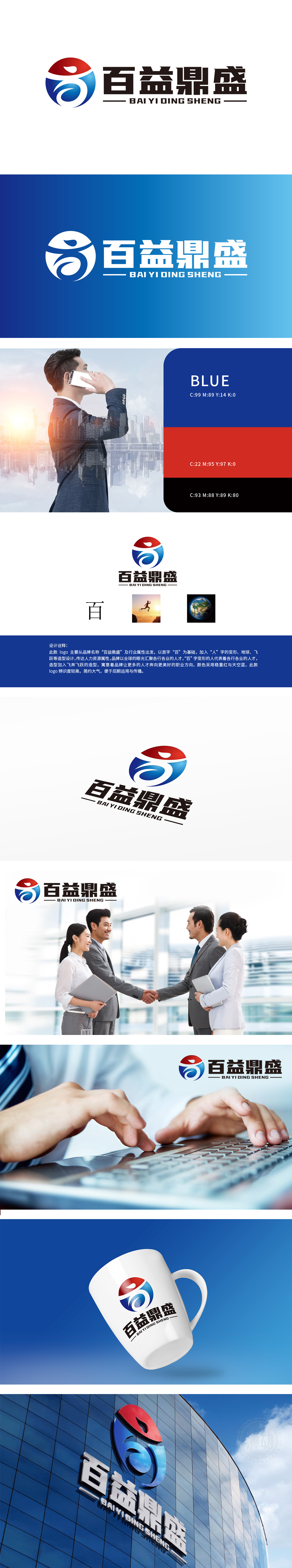
狮动设计以百”字变形:结合“人”字的变形,象征着品牌汇聚各行各业的人才。地球代表全球视野,表明品牌以全球眼光汇聚人才。飞奔飞跃的造型:寓意品牌引导人才奔向更美好的职业方向。重构人力资源理念,将“吸引-赋能-跃升”的人才价值链凝练为视觉符号,彰显企业“以人为核心”的战略雄心。
Lion design is transformed with the word "hundred": combined with the transformation of the word "people", it symbolizes that the brand gathers talents from all walks of life. The earth represents a global vision, indicating that the brand gathers talents with a global vision.The shape of flying and leaping: it means that the brand guides talents to a better career direction. Reconstruct the concept of human resources.


扫码或拨打添加客服微信


