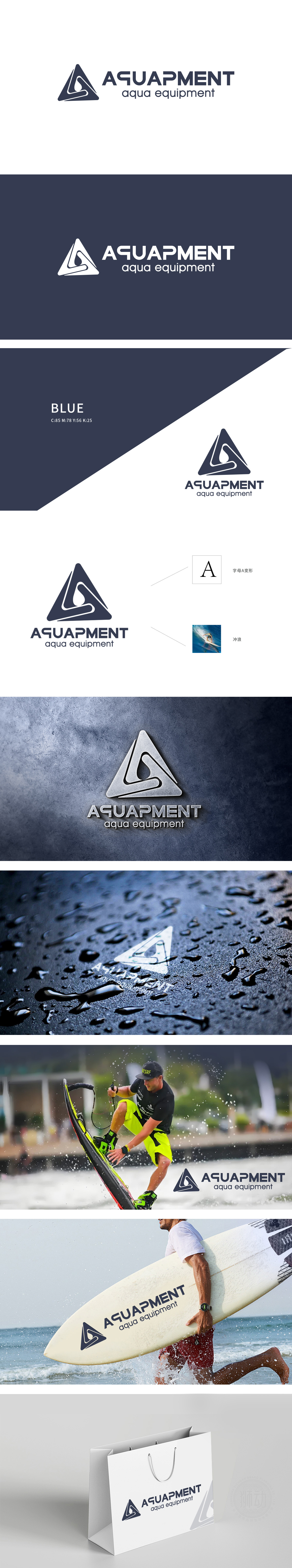
狮动设计以字母A变形,深蓝色三角形为基底,稳定的三角结构象征专业与可靠,符合水上运动装备的功能性定位。三角形内部嵌入流畅的白色曲线,模拟冲浪者在浪尖滑行的动态轨迹——曲线从左下角向右上方延伸,形成向上冲刺的趋势,既呼应了“冲浪”的运动姿态,又传递出活力、自由与突破的品牌精神。曲线与三角形边缘的留白处理,巧妙勾勒出“浪花”与“冲浪板”的抽象形态:底部弧线像卷起的浪花,顶部锐角则暗合冲浪板的尖锐轮廓,整体图形在极简中完成了“运动场景+装备属性”的双重隐喻。
Lion design is based on the letter A and dark blue triangle. The stable triangle structure symbolizes professionalism and reliability, which conforms to the functional positioning of water sports equipment. A smooth white curve is embedded in the triangle to simulate the dynamic trajectory of surfers sliding on the waves-the curve extends from the lower left corner to the upper right, forming an upward sprint trend, which not only echoes the sports posture of "surfing", but also conveys the brand spirit of vitality, freedom and breakthrough. The edges of curves and triangles are left blank, which skillfully outlines the abstract forms of "waves" and "surfboards".


扫码或拨打添加客服微信


